# Load the tidycensus package into your R session
library(tidycensus)
library(tidyverse)
library(data.table)
library(tigris)
library(here)

# Define your Census API key and set it with census_api_key()
api_key <- Sys.getenv("CENSUS_API_KEY")

census_api_key(api_key)Census data in r with tidycensus
Obtain and set your Census API key
tidycensus is an R package designed to return data from the US Census Bureau ready for use within the Tidyverse.
To acquire data from the US Census Bureau using the tidycensus R package, you must first acquire and set a Census API key. After obtaining your key, you can install it for future use with the census_api_key() function in tidycensus.
This exercise uses a fake API key for purposes of illustration.
##Setting a cache directory Spatial data from the US Census Bureau can get very big - sometimes hundreds of megabytes in size. By default, tigris functions download data from the US Census Bureau’s website - but this can get tiresome if downloading the same large datasets over and over. To resolve this, tigris includes an option to cache downloaded data on a user’s computer for future use, meaning that files only have to be downloaded from the Census website once. In this exercise, you’ll get acquainted with the caching functionality in tigris.
# Set the cache directory
tigris_cache_dir(here("tigris_cache"))

# Set the tigris_use_cache option
options(tigris_use_cache = TRUE)

# Check to see that you've modified the option correctly
getOption("tigris_use_cache")
[1] TRUEGetting Census data with tidycensus
In this exercise, you will load and inspect data from the 2010 US Census and 2012-2016 American Community Survey. The core functions of get_decennial() and get_acs() in tidycensus are used to obtain data from these sources; the 2010 Census and 2012-2016 ACS are the defaults for these functions, respectively.
By inspecting the data, you’ll get a sense of differences between decennial US Census data and data from the ACS, which is based on a sample and subject to a margin of error. Whereas get_decennial() returns a data value for each row, get_acs() returns estimate and moe columns representing the ACS estimate and margin of error.
# Obtain and view state populations from the 2010 US Census
state_pop <- get_decennial(geography = "state",
                           variables = "P001001")

head(state_pop)
# A tibble: 6 × 4
GEOID NAME variable value
<chr> <chr> <chr> <dbl>
1 01 Alabama P001001 4779736
2 02 Alaska P001001 710231
3 04 Arizona P001001 6392017
4 05 Arkansas P001001 2915918
5 06 California P001001 37253956
6 22 Louisiana P001001 4533372# Obtain and view state median household income from the 2012-2016 American Community Survey
state_income <- get_acs(geography = "state",
variables = "B19013_001")
head(state_income)# A tibble: 6 × 5
GEOID NAME variable estimate moe
<chr> <chr> <chr> <dbl> <dbl>
1 01 Alabama B19013_001 54943 377
2 02 Alaska B19013_001 80287 1113
3 04 Arizona B19013_001 65913 387
4 05 Arkansas B19013_001 52123 458
5 06 California B19013_001 84097 236
6 08 Colorado B19013_001 80184 450Understanding tidycensus options
As discussed in this lesson, Census data comprise thousands of variables available across dozens of geographies! Most of these geography-variable combinations are accessible with tidycensus; however, it helps to understand the package options.
Some data, like Census tracts, are only available by state, and users might want to subset by county; tidycensus facilitates this with state and county parameters when appropriate. Additionally, tidycensus includes the Census variable ID in the variable column; however, a user might want to supply her own variable name, which can be accomplished with a named vector.
You’ll be using the Census variable B19013_001 here, which refers to median household income.
# Get an ACS dataset for Census tracts in Texas by setting the state
tx_income <- get_acs(geography = "tract",
                     variables = "B19013_001",
                     state = "TX")

# Inspect the dataset
head(tx_income)
# A tibble: 6 × 5
GEOID NAME variable estimate moe
<chr> <chr> <chr> <dbl> <dbl>
1 48001950100 Census Tract 9501, Anderson County, Texas B19013_… 61325 9171
2 48001950401 Census Tract 9504.01, Anderson County, Te… B19013_… 92813 45136
3 48001950402 Census Tract 9504.02, Anderson County, Te… B19013_… NA NA
4 48001950500 Census Tract 9505, Anderson County, Texas B19013_… 41713 6650
5 48001950600 Census Tract 9506, Anderson County, Texas B19013_… 32552 12274
6 48001950700 Census Tract 9507, Anderson County, Texas B19013_… 35811 5573# Get an ACS dataset for Census tracts in Travis County, TX
travis_income <- get_acs(geography = "tract",
variables = "B19013_001",
state = "TX",
county = "Travis")
# Inspect the dataset
head(travis_income)# A tibble: 6 × 5
GEOID NAME variable estimate moe
<chr> <chr> <chr> <dbl> <dbl>
1 48453000101 Census Tract 1.01, Travis County, Texas B19013_001 121964 31935
2 48453000102 Census Tract 1.02, Travis County, Texas B19013_001 201417 26672
3 48453000203 Census Tract 2.03, Travis County, Texas B19013_001 81994 14344
4 48453000204 Census Tract 2.04, Travis County, Texas B19013_001 93219 26118
5 48453000205 Census Tract 2.05, Travis County, Texas B19013_001 75000 24198
6 48453000206 Census Tract 2.06, Travis County, Texas B19013_001 88342 10549# Supply custom variable names
travis_income2 <- get_acs(geography = "tract",
variables = c(hhincome = "B19013_001"),
state = "TX",
county = "Travis")
# Inspect the dataset
head(travis_income2)# A tibble: 6 × 5
GEOID NAME variable estimate moe
<chr> <chr> <chr> <dbl> <dbl>
1 48453000101 Census Tract 1.01, Travis County, Texas hhincome 121964 31935
2 48453000102 Census Tract 1.02, Travis County, Texas hhincome 201417 26672
3 48453000203 Census Tract 2.03, Travis County, Texas hhincome 81994 14344
4 48453000204 Census Tract 2.04, Travis County, Texas hhincome 93219 26118
5 48453000205 Census Tract 2.05, Travis County, Texas hhincome 75000 24198
6 48453000206 Census Tract 2.06, Travis County, Texas hhincome 88342 10549Tidy and wide data in tidycensus
By default, tidycensus functions return tidy data frames, in which each row represents a unique unit-variable combination. However, at times it is useful to have each Census variable in its own column for some methods of visualization and analysis. To accomplish this, you can set output = “wide” in your calls to get_acs() or get_decennial(), which will place estimates/values and margins of error in their own columns.
# Return county data in wide format
or_wide <- get_acs(geography = "county",
                     state = "OR",
                     variables = c(hhincome = "B19013_001",
                            medage = "B01002_001"),
                     output = "wide")

# Compare output to the tidy format from previous exercises
head(or_wide)
# A tibble: 6 × 6
GEOID NAME hhincomeE hhincomeM medageE medageM
<chr> <chr> <dbl> <dbl> <dbl> <dbl>
1 41001 Baker County, Oregon 46922 3271 47.7 0.9
2 41003 Benton County, Oregon 68732 2689 33.3 0.3
3 41005 Clackamas County, Oregon 88517 1424 41.6 0.2
4 41007 Clatsop County, Oregon 61846 2651 44.5 0.4
5 41009 Columbia County, Oregon 73909 3517 43.3 0.4
6 41011 Coos County, Oregon 52548 3145 48.4 0.3# Create a scatterplot
plot(or_wide$hhincomeE, or_wide$medageE)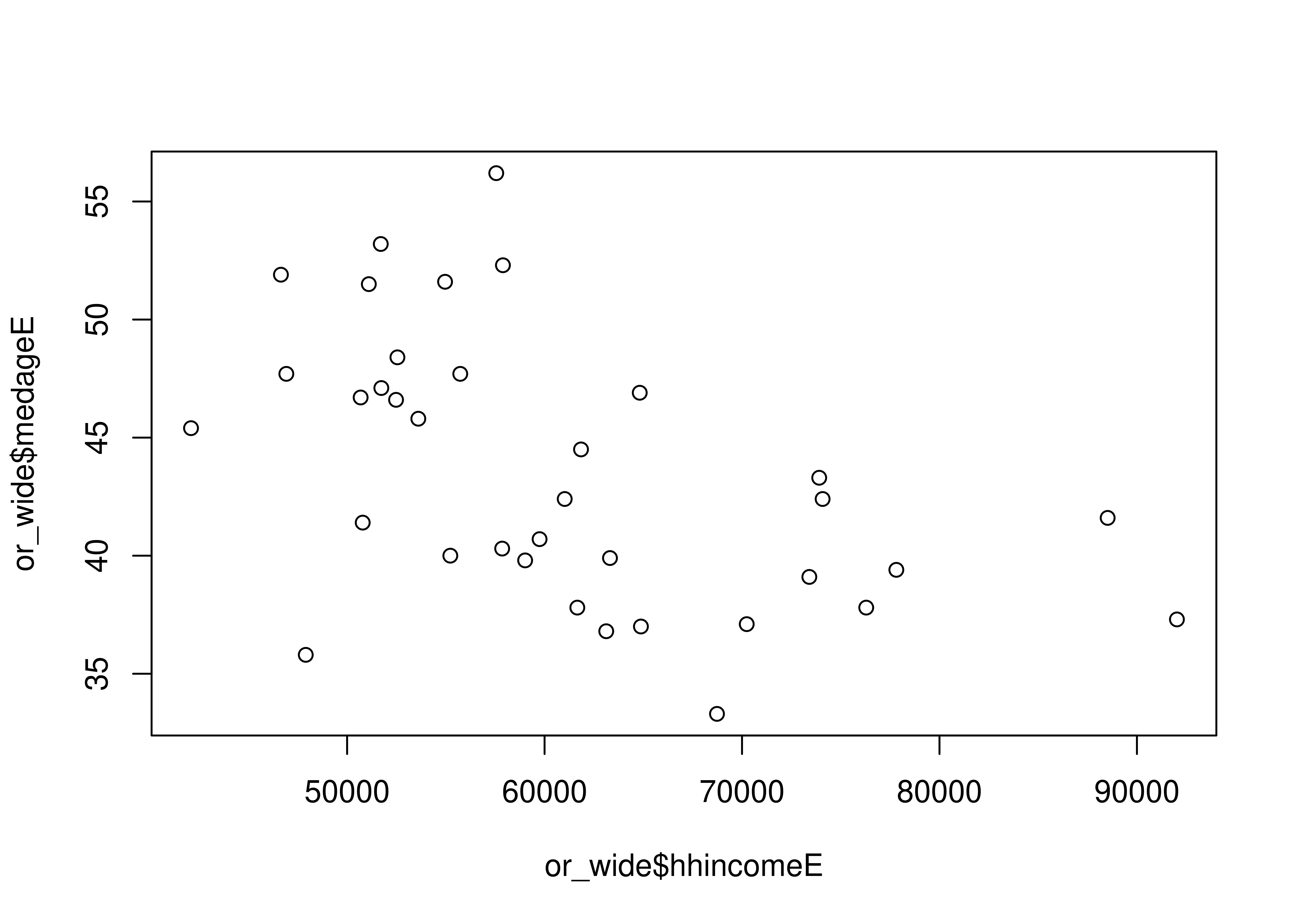
Loading variables in tidycensus
There are hundreds of thousands of variables in the decennial Census and American Community Survey samples, which can make it difficult to know which variable codes to use! tidycensus aims to make this easier with the load_variables() function, which obtains a dataset of variables from a specified sample and loads it into R as a browsable data frame.
# Load variables from the 2012-2016 ACS
v16 <- load_variables(year = 2016,
           dataset = "acs5",
           cache = TRUE)

# Get variables from the ACS Data Profile
v16p <- load_variables(year = 2016,
                       dataset = "acs5/profile",
                       cache = TRUE)

# Set year and dataset to get variables from the 2000 Census SF3
v00 <- load_variables(year = 2000,
                      dataset = "sf3",
                      cache = TRUE)
Exploring variables with tidyverse tools
Once loaded, your dataset of Census or ACS variables might contain thousands of rows. In RStudio, it is recommended to use the View() function to interactively search for these variables. Outside of RStudio, these datasets can be browsed using tidyverse filtering tools.
# Filter for table B19001
filter(v16, str_detect(name, "B19001"))
# A tibble: 170 × 4
name label concept geography
<chr> <chr> <chr> <chr>
1 B19001A_001 Estimate!!Total HOUSEHOLD INCOME I… tract
2 B19001A_002 Estimate!!Total!!Less than $10,000 HOUSEHOLD INCOME I… tract
3 B19001A_003 Estimate!!Total!!$10,000 to $14,999 HOUSEHOLD INCOME I… tract
4 B19001A_004 Estimate!!Total!!$15,000 to $19,999 HOUSEHOLD INCOME I… tract
5 B19001A_005 Estimate!!Total!!$20,000 to $24,999 HOUSEHOLD INCOME I… tract
6 B19001A_006 Estimate!!Total!!$25,000 to $29,999 HOUSEHOLD INCOME I… tract
7 B19001A_007 Estimate!!Total!!$30,000 to $34,999 HOUSEHOLD INCOME I… tract
8 B19001A_008 Estimate!!Total!!$35,000 to $39,999 HOUSEHOLD INCOME I… tract
9 B19001A_009 Estimate!!Total!!$40,000 to $44,999 HOUSEHOLD INCOME I… tract
10 B19001A_010 Estimate!!Total!!$45,000 to $49,999 HOUSEHOLD INCOME I… tract
# ℹ 160 more rows# Use public transportation to search for related variables
filter(v16p, str_detect(label, fixed("public transportation",
ignore_case = TRUE)))# A tibble: 2 × 3
name label concept
<chr> <chr> <chr>
1 DP03_0021 Estimate!!COMMUTING TO WORK!!Workers 16 years and over!!Pu… SELECT…
2 DP03_0021P Percent!!COMMUTING TO WORK!!Workers 16 years and over!!Pub… SELECT…Comparing geographies with ggplot2 visualizations
When exploring Census or ACS data, you’ll often want to know how data varies among different geographic units. For example - which US states have higher - or lower - median household incomes? This can be accomplished through visualization using dot plots, which are particularly effective for showing ranks visually. In this exercise, you’ll use the popular ggplot2 data visualization package to accomplish this.
# Access the 1-year ACS  with the survey parameter
ne_income <- get_acs(geography = "state",
                     variables = "B19013_001",
                     survey = "acs1",
                     state = c("ME", "NH", "VT", "MA",
                               "RI", "CT", "NY"))

# Create a dot plot


# Reorder the states in descending order of estimates
ggplot(ne_income, aes(x = estimate, y = reorder(NAME, estimate))) +
  geom_point()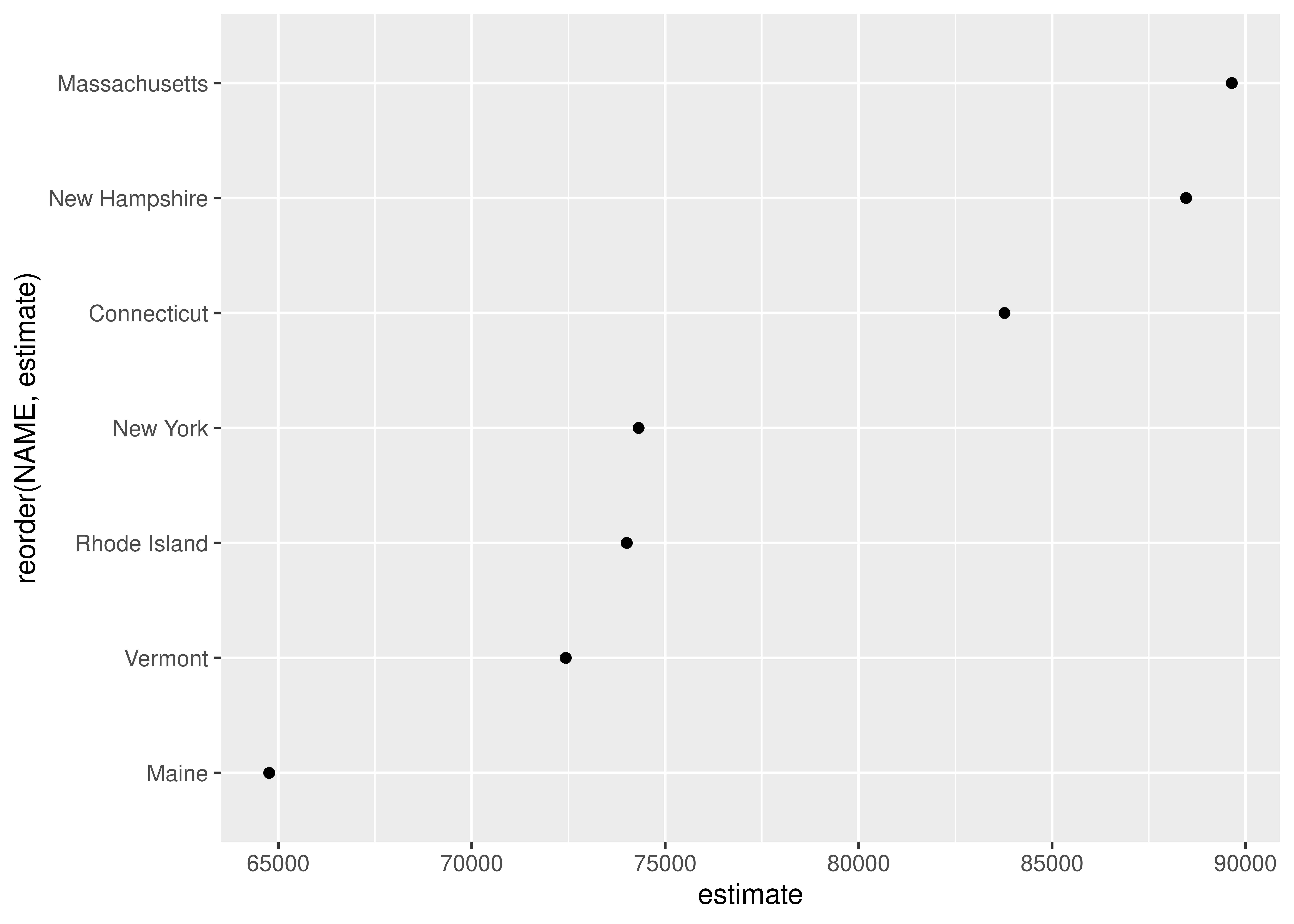
Customizing ggplot2 visualizations of ACS data
While the ggplot2 defaults are excellent for exploratory visualization of data, you’ll likely want to customize your charts before sharing them with others. In this exercise, you’ll customize your tidycensus dot plot by modifying the chart colors, tick labels, and axis labels. You’ll also learn how to format labels using the scales package, as label formatters can be imported using the :: syntax.
# Set dot color and size
g_color <- ggplot(ne_income, aes(x = estimate, y = reorder(NAME, estimate))) +
  geom_point(color = "navy", size = 4)

# Format the x-axis labels
g_scale <- g_color +
  scale_x_continuous(labels = scales::dollar) +
  theme_minimal(base_size = 12)

# Label your x-axis, y-axis, and title your chart
g_label <- g_scale +
  labs(x ="2016 ACS estimate",
       y = "",
       title = "Median household income by state")

g_label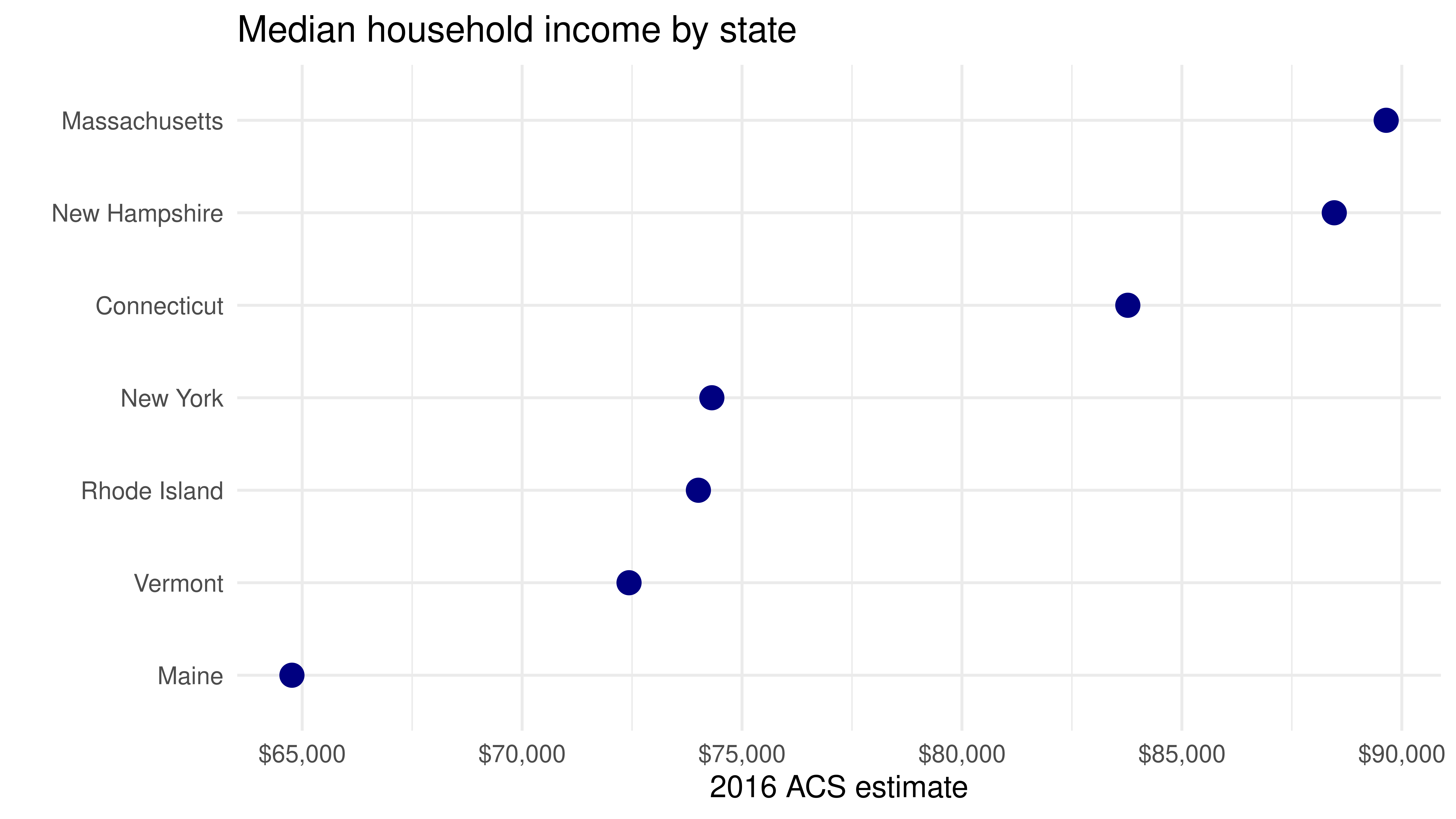
Download and view a table of data from the ACS
Variables in the decennial Census and American Community Survey are organized into tables, within which they share a common prefix. Commonly, analysts will want to work with all variables in a given table, as these variables might represent different aspects of a common characteristic (such as race or income levels). To request data for an entire table in tidycensus, users can specify a table argument with the table prefix, and optionally cache a dataset of table codes to speed up table searching in future requests. In this exercise, you’ll acquire a table of variables representing different income bands, then filter out the denominator rows.
# Download table "B19001"
wa_income <- get_acs(geography = "county",
                 state = "WA",
                 table = "B19001")

# Check out the first few rows of wa_income
head(wa_income)
# A tibble: 6 × 5
GEOID NAME variable estimate moe
<chr> <chr> <chr> <dbl> <dbl>
1 53001 Adams County, Washington B19001_001 6158 123
2 53001 Adams County, Washington B19001_002 474 171
3 53001 Adams County, Washington B19001_003 255 107
4 53001 Adams County, Washington B19001_004 204 90
5 53001 Adams County, Washington B19001_005 393 134
6 53001 Adams County, Washington B19001_006 358 159Get a summary variable and calculate percentages
Many variables in the Census and American Community Survey are represented as counts or estimated counts. While count data is useful for some applications, it is often good practice to normalize count data by its denominator to convert it to a proportion or percentage to make clearer comparisons. This is facilitated in tidycensus with the summary_var argument, which allows users to request that a variable is given its own column in a tidy Census dataset. This value can then be used as the denominator for subsequent calculations of percentages.
Summary question: When the summary_var parameter is requested in get_acs(), what information is returned by the function?
# Assign Census variables vector to race_vars
race_vars <- c(White = "B03002_003", Black = "B03002_004", Native = "B03002_005",
               Asian = "B03002_006", HIPI = "B03002_007", Hispanic = "B03002_012")

# Request a summary variable from the ACS
ca_race <- get_acs(geography = "county",
                   state = "CA",
                   variables = race_vars,
                   summary_var = "B03002_001")

# Calculate a new percentage column and check the result
ca_race_pct <- ca_race %>%
  mutate(pct = 100 * (estimate / summary_est))

head(ca_race_pct)
# A tibble: 6 × 8
GEOID NAME variable estimate moe summary_est summary_moe pct
<chr> <chr> <chr> <dbl> <dbl> <dbl> <dbl> <dbl>
1 06001 Alameda County, … White 499730 988 1673133 NA 29.9
2 06001 Alameda County, … Black 166017 1837 1673133 NA 9.92
3 06001 Alameda County, … Native 5248 318 1673133 NA 0.314
4 06001 Alameda County, … Asian 524980 2437 1673133 NA 31.4
5 06001 Alameda County, … HIPI 12699 566 1673133 NA 0.759
6 06001 Alameda County, … Hispanic 374542 NA 1673133 NA 22.4 Finding the largest group by county
tidyverse data wrangling tools in packages like dplyr and purrr are extremely powerful for exploring Census data. tidycensus is specifically designed with data exploration within the tidyverse in mind. For example, users might be interested in finding out the largest racial/ethnic group within each county for a given state. This can be accomplished using dplyr grouping capabilities, which allow users to identify the largest ACS group estimate and filter to retain the rows that match that group.
# Group the dataset and filter the estimate
ca_largest <- ca_race %>%
  group_by(GEOID) %>%
  filter(estimate == max(estimate))

head(ca_largest)
# A tibble: 6 × 7
# Groups: GEOID [6]
GEOID NAME variable estimate moe summary_est summary_moe
<chr> <chr> <chr> <dbl> <dbl> <dbl> <dbl>
1 06001 Alameda County, Califor… Asian 524980 2437 1673133 NA
2 06003 Alpine County, Californ… White 730 153 1344 228
3 06005 Amador County, Californ… White 30081 412 40095 NA
4 06007 Butte County, California White 153153 300 217884 NA
5 06009 Calaveras County, Calif… White 35925 129 45349 NA
6 06011 Colusa County, Californ… Hispanic 13177 NA 21780 NA# Group the dataset and get a breakdown of the results
ca_largest %>%
group_by(variable) %>%
tally()# A tibble: 3 × 2
variable n
<chr> <int>
1 Asian 2
2 Hispanic 16
3 White 40Recoding variables and calculating group sums
dplyr, one of the core packages within the tidyverse, includes numerous functions for data wrangling. This functionality allows users to recode datasets, define groups within those datasets, and perform calculations over those groups. Such operations commonly take place within a pipe, denoted with the %>% operator.
In this exercise, you’ll work with ACS data in just such a tidyverse workflow. You’ll be identifying median household income variables in ACS table B19001 that are below $35,000; between $35,000 and $75,000; and above $75,000. You’ll then tabulate the number of households that fall into each group for counties in Washington.
# Use a tidy workflow to wrangle ACS data
wa_grouped <- wa_income %>%
  filter(variable != "B19001_001") %>%
  mutate(incgroup = case_when(
    variable < "B19001_008" ~ "below35k",
    variable < "B19001_013" ~ "35kto75k",
    TRUE ~ "above75k"
  )) %>%
  group_by(NAME, incgroup) %>%
  summarize(group_est = sum(estimate))

wa_grouped
# A tibble: 117 × 3
# Groups: NAME [39]
NAME incgroup group_est
<chr> <chr> <dbl>
1 Adams County, Washington 35kto75k 2156
2 Adams County, Washington above75k 2094
3 Adams County, Washington below35k 1908
4 Asotin County, Washington 35kto75k 3215
5 Asotin County, Washington above75k 3537
6 Asotin County, Washington below35k 2535
7 Benton County, Washington 35kto75k 21285
8 Benton County, Washington above75k 37911
9 Benton County, Washington below35k 15094
10 Chelan County, Washington 35kto75k 9163
# ℹ 107 more rowsComparing ACS estimates for multiple years
The American Community Survey is updated every year, which allows researchers to use ACS datasets to study demographic changes over time.
In this exercise, you’ll learn how to use the tidyverse function map_df() to work with multi-year ACS data. map_df() helps analysts iterate through a sequence of values, compute a process for each of those values, then combine the results into a single data frame. You’ll be using map_df() in this way with ACS data, as you iterate through a vector of years, retrieve ACS data for each year, and combine the results. This will allow you to view how ACS estimates have changed over time.
# Map through ACS1 estimates to see how they change through the years
mi_cities <- map_df(2012:2016, function(x) {
  get_acs(geography = "place",
          variables = c(totalpop = "B01003_001"),
          state = "MI",
          survey = "acs1",
          year = x) %>%
    mutate(year = x)
})

mi_cities %>% arrange(NAME, year)
# A tibble: 80 × 6
GEOID NAME variable estimate moe year
<chr> <chr> <chr> <dbl> <dbl> <int>
1 2603000 Ann Arbor city, Michigan totalpop 116128 35 2012
2 2603000 Ann Arbor city, Michigan totalpop 117034 43 2013
3 2603000 Ann Arbor city, Michigan totalpop 117759 44 2014
4 2603000 Ann Arbor city, Michigan totalpop 117070 33 2015
5 2603000 Ann Arbor city, Michigan totalpop 120777 33 2016
6 2621000 Dearborn city, Michigan totalpop 96470 28 2012
7 2621000 Dearborn city, Michigan totalpop 95888 35 2013
8 2621000 Dearborn city, Michigan totalpop 95546 48 2014
9 2621000 Dearborn city, Michigan totalpop 95180 40 2015
10 2621000 Dearborn city, Michigan totalpop 94430 52 2016
# ℹ 70 more rowsInspecting margins of error
ACS data are distinct from decennial Census data in that they represent estimates with an associated margin of error. ACS margins of error by default represent a 90 percent confidence level around an estimate, which means that we are 90 percent sure that the true value falls within a range of the reported estimate plus or minus the reported margin of error.
In this exercise, you’ll get some experience working with data that has high margins of error relative to their estimates. We’ll use the example of poverty for the population aged 75 and above for Census tracts in Vermont.
# Get data on elderly poverty by Census tract in Vermont
vt_eldpov <- get_acs(geography = "tract",
                     variables = c(eldpovm = "B17001_016",
                                   eldpovf = "B17001_030"),
                     state = "VT")

vt_eldpov
# A tibble: 386 × 5
GEOID NAME variable estimate moe
<chr> <chr> <chr> <dbl> <dbl>
1 50001960100 Census Tract 9601, Addison County, Vermo… eldpovm 2 5
2 50001960100 Census Tract 9601, Addison County, Vermo… eldpovf 8 7
3 50001960200 Census Tract 9602, Addison County, Vermo… eldpovm 4 6
4 50001960200 Census Tract 9602, Addison County, Vermo… eldpovf 0 10
5 50001960300 Census Tract 9603, Addison County, Vermo… eldpovm 0 10
6 50001960300 Census Tract 9603, Addison County, Vermo… eldpovf 7 9
7 50001960400 Census Tract 9604, Addison County, Vermo… eldpovm 7 10
8 50001960400 Census Tract 9604, Addison County, Vermo… eldpovf 15 11
9 50001960500 Census Tract 9605, Addison County, Vermo… eldpovm 6 10
10 50001960500 Census Tract 9605, Addison County, Vermo… eldpovf 14 16
# ℹ 376 more rows# Identify rows with greater margins of error than their estimates
moe_check <- filter(vt_eldpov, moe > estimate)
# Check proportion of rows where the margin of error exceeds the estimate
nrow(moe_check) / nrow(vt_eldpov)[1] 0.7927461Using margin of error functions in tidycensus
While the Census Bureau API and tidycensus return pre-computed margins of error for you, you may want to derive new estimates from downloaded ACS data and in turn understand the margins of error around these derived estimates. tidycensus includes four functions (listed below) to help you with these tasks, each of which incorporates the recommended formulas from the US Census Bureau.
moe_sum() moe_product() moe_ratio() moe_prop()
# Calculate a margin of error for a sum
moe_sum(moe = c(55, 33, 44, 12, 4))
[1] 78.80355# Calculate a margin of error for a product
moe_product(est1 = 55,
est2 = 33,
moe1 = 12,
moe2 = 9)[1] 633.9093# Calculate a margin of error for a ratio
moe_ratio(num = 1000,
denom = 950,
moe_num = 200,
moe_denom = 177)[1] 0.287724# Calculate a margin of error for a proportion
moe_prop(num = 374,
denom = 1200,
moe_num = 122,
moe_denom = 333)[1] 0.05344178Calculating group-wise margins of error
One way to reduce margins of error in an ACS analysis is to combine estimates when appropriate. This can be accomplished using tidyverse group-wise data analysis tools. In this exercise, you’ll combine estimates for male and female elderly poverty in Vermont, and use the moe_sum() function as part of this group-wise analysis. While you may lose some detail with this type of approach, your estimates will be more reliable relative to their margins of error than before you combined them.
# Group the dataset and calculate a derived margin of error
vt_eldpov2 <- vt_eldpov %>%
  group_by(GEOID) %>%
  summarize(
    estmf = sum(estimate),
    moemf = moe_sum(moe = moe, estimate = estimate)
  )

# Filter rows where newly-derived margin of error exceeds newly-derived estimate
moe_check2 <- filter(vt_eldpov2, moemf > estmf)

# Check proportion of rows where margin of error exceeds estimate
nrow(moe_check2) / nrow(vt_eldpov2)
[1] 0.626943Quick visual exploration of ACS margins of error
In Chapter 1, you learned how to create a dot plot of ACS income estimates. In this chapter, you’ve also learned about the importance of taking margins of error into account in ACS analyses. While margins of error are likely minimal for state-level estimates, they may be more significant for sub-state estimates, like counties. In this exercise, you’ll learn how to visualize margins of error around estimates with ggplot2.
# Request median household income data
maine_inc <- get_acs(geography = "county",
                     variables = c(hhincome = "B19013_001"),
                     state = "ME")

# Generate horizontal error bars with dots
ggplot(maine_inc, aes(x = estimate, y = NAME)) +
  geom_errorbarh(aes(xmin = estimate - moe, xmax = estimate + moe)) +
  geom_point()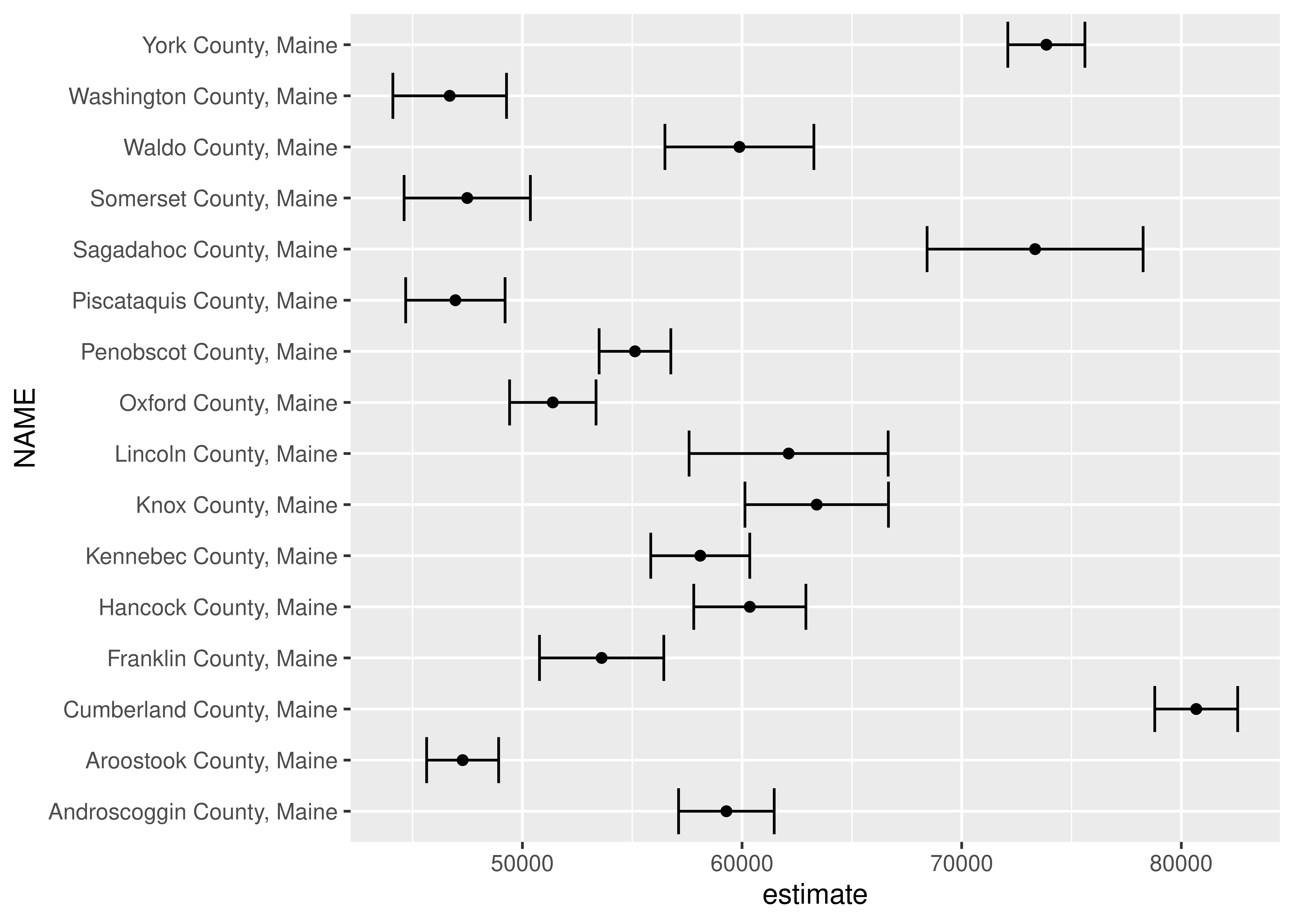
Customizing a ggplot2 margin of error plot
You’ve hopefully identified some problems with the chart you created in the previous exercise. As the counties are not ordered, patterns in the data are difficult for a viewer to parse. Specifically, margin of error plots are much more effective when dots are ordered as the ordering allows viewers to understand the uncertainty in estimate values relative to other estimates. Additionally, the lack of plot formatting makes it difficult for chart viewers to understand the chart’s content. In this exercise, you’ll clean up your ggplot2 code to create a much more visually appealing margin of error chart.
# Remove unnecessary content from the county's name
maine_inc2 <- maine_inc %>%
  mutate(NAME = str_replace(NAME, " County, Maine", ""))

# Build a margin of error plot incorporating your modifications
ggplot(maine_inc2, aes(x = estimate, y = reorder(NAME, estimate))) +
  geom_errorbarh(aes(xmin = estimate - moe, xmax = estimate + moe)) +
  geom_point(size = 3, color = "darkgreen") +
  theme_grey(base_size = 14) +
  labs(title = "Median household income",
       subtitle = "Counties in Maine",
       x = "ACS estimate (bars represent margins of error)",
       y = "") +
  scale_x_continuous(labels = scales::dollar)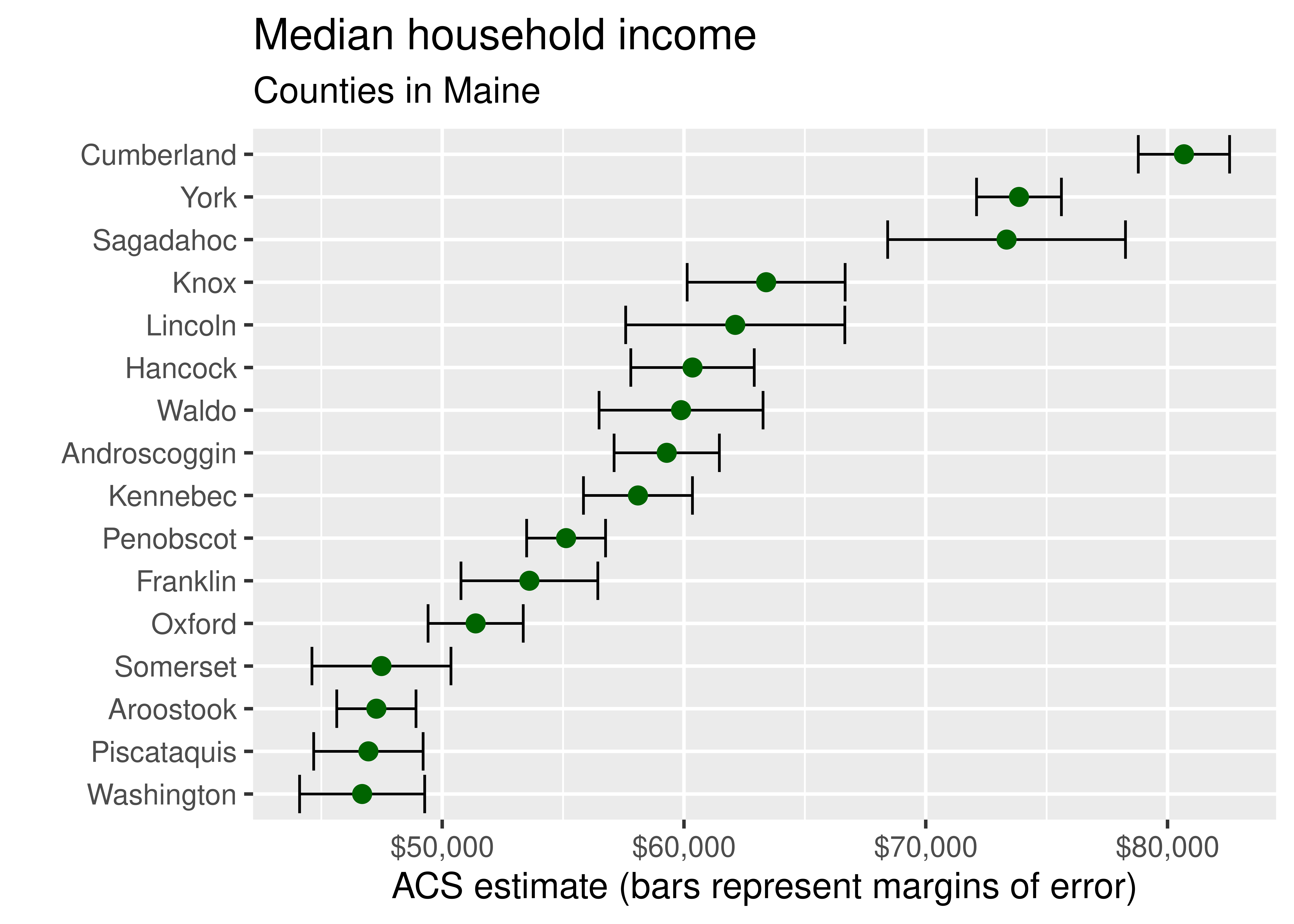
Getting Census boundary files with tigris
The US Census Bureau’s TIGER/Line shapefiles include boundary files for the geography at which decennial Census and ACS data are aggregated. These geographies include legal entities that have legal standing in the U.S., such as states and counties, and statistical entities used for data tabulation such as Census tracts and block groups. In this exercise, you’ll use the tigris package to acquire such boundary files for counties in Colorado and Census tracts for Colorado’s Denver County, which covers the city of Denver.
# Get a counties dataset for Colorado and plot it
co_counties <- counties(state = "CO")
plot(co_counties)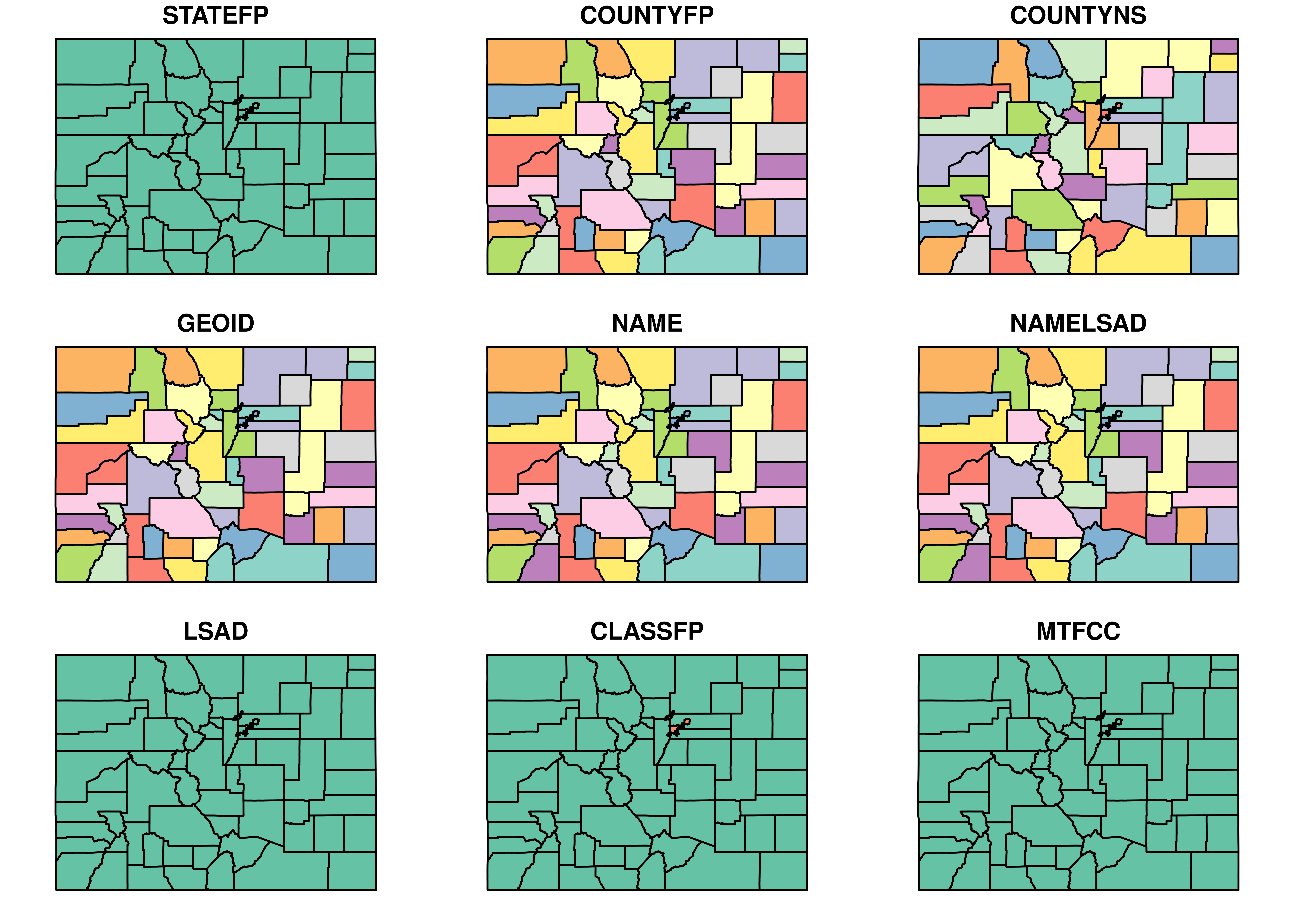
# Get a Census tracts dataset for Denver County, Colorado and plot it
denver_tracts <- tracts(state = "CO", county = "Denver")
plot(denver_tracts)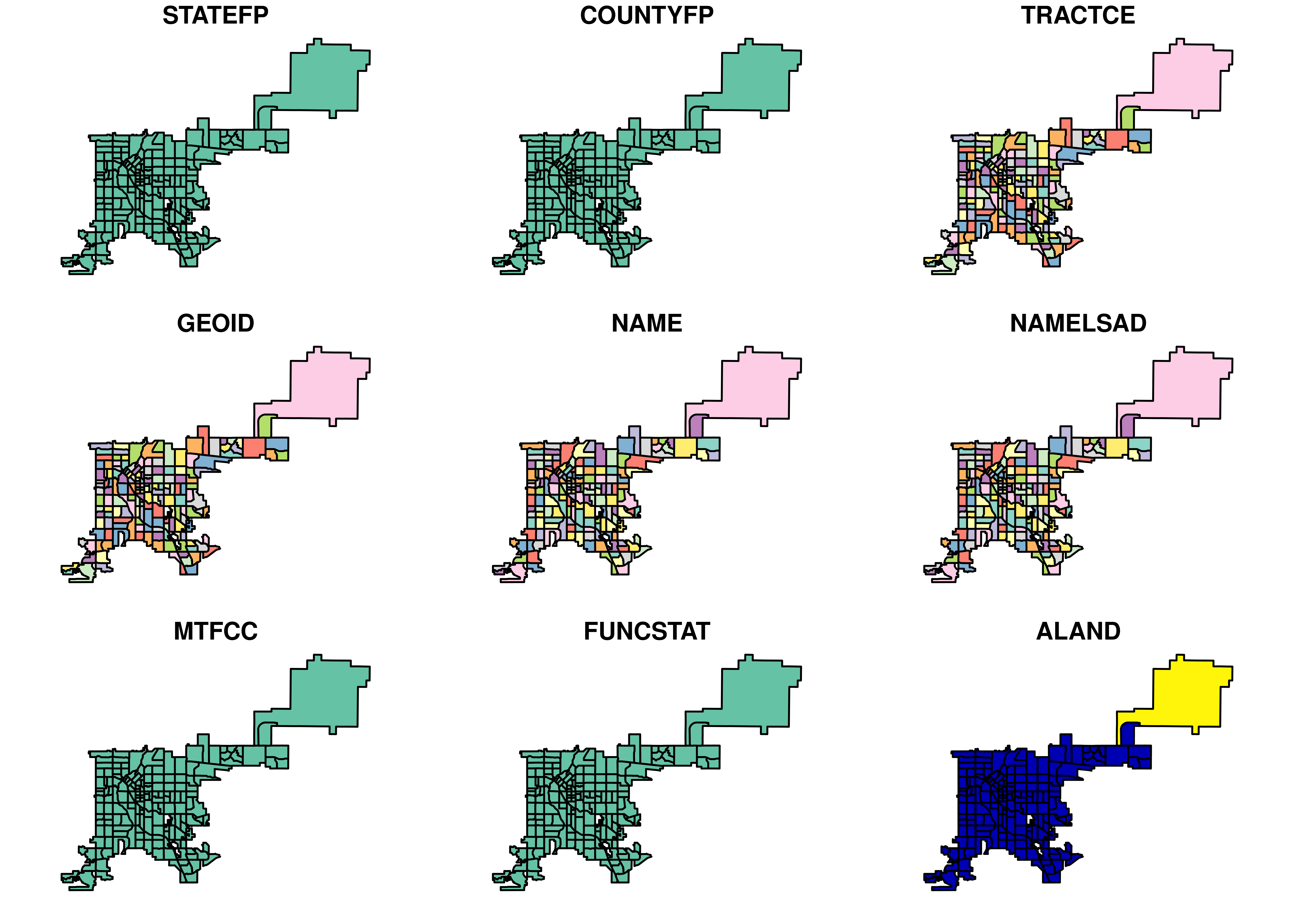
Getting geographic features with tigris
In addition to enumeration units, the TIGER/Line database produced by the Census Bureau includes geographic features. These features consist of several datasets for use in thematic mapping and spatial analysis, such as transportation infrastructure and water features. In this exercise, you’ll acquire and plot roads and water data with tigris.
# Plot area water features for Lane County, Oregon
lane_water <- area_water(state = "OR", county = "Lane")
plot(lane_water)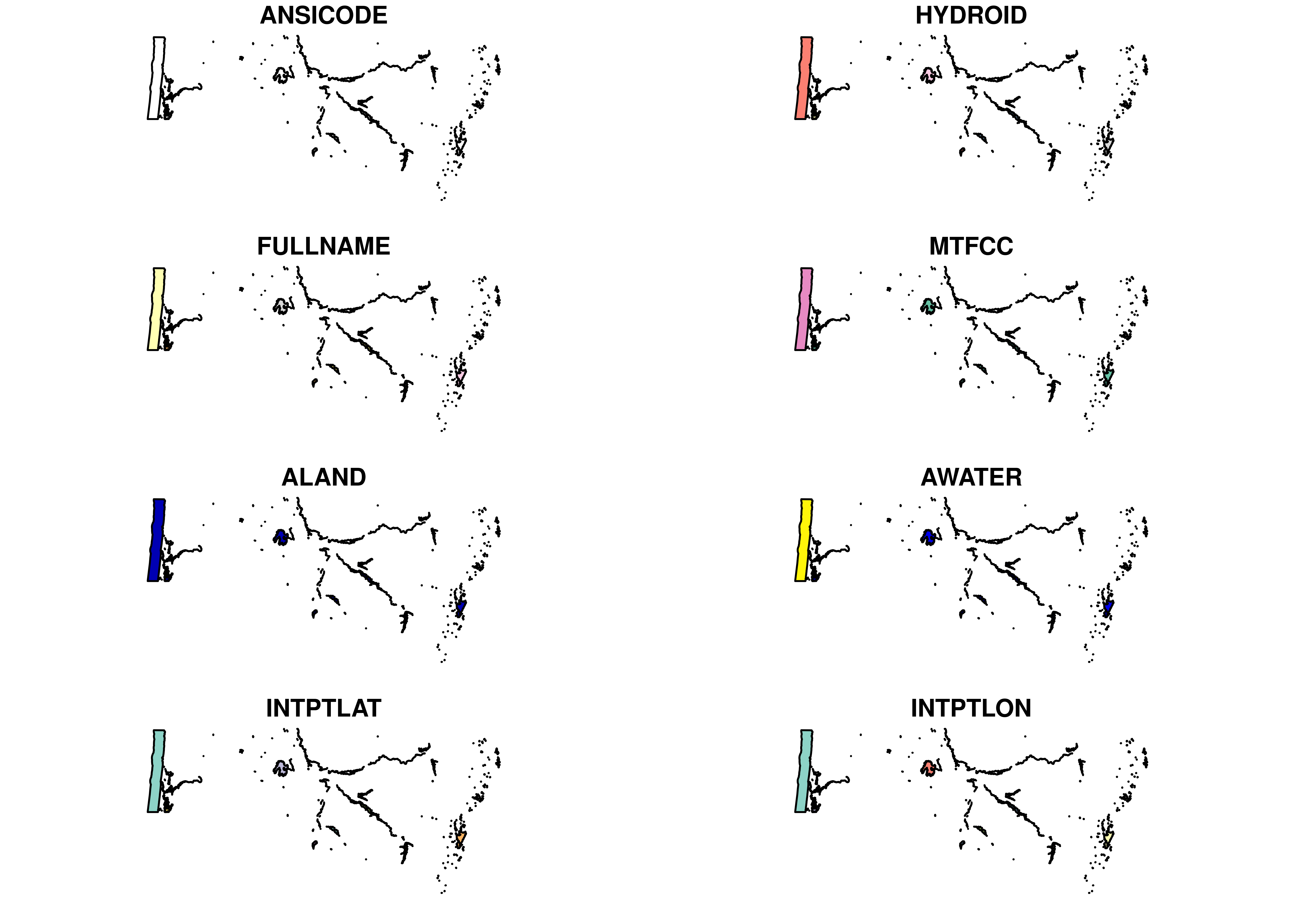
# Plot primary & secondary roads for the state of New Hampshire
nh_roads <- primary_secondary_roads(state = "NH")
plot(nh_roads)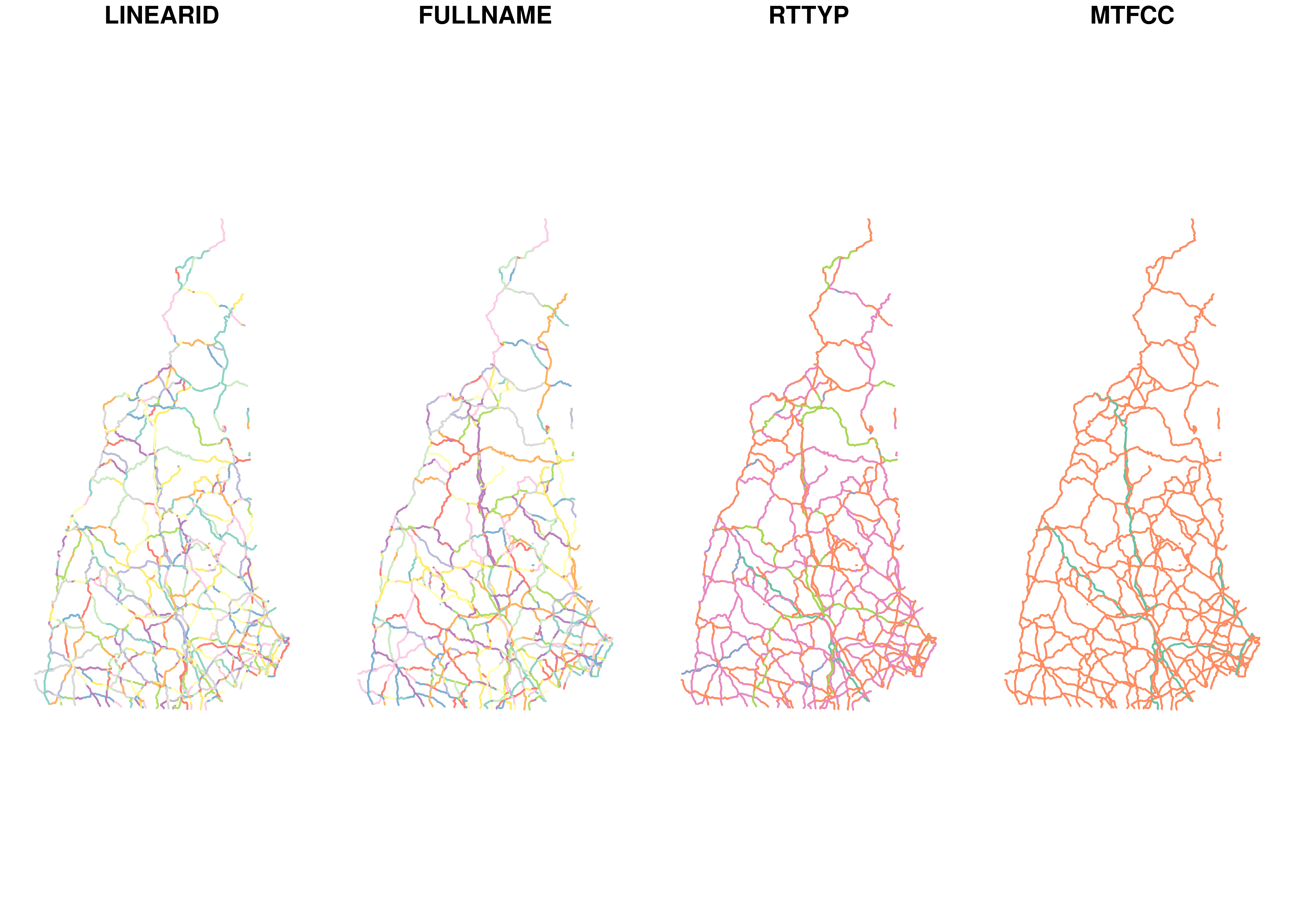
Understanding the structure of tigris objects
By default, tigris returns objects of class SpatialDataFrame from the sp package. Objects of class Spatial represent components of spatial data in different slots, which include descriptions of the object’s geometry, attributes, and coordinate system. In this exercise, we’ll briefly examine the structure of objects returned by tigris functions.
# Check the class of the data
class(co_counties)
[1] "sf" "data.frame"# Take a look at the information in the data slot
head(co_counties)Simple feature collection with 6 features and 17 fields
Geometry type: MULTIPOLYGON
Dimension: XY
Bounding box: xmin: -108.3811 ymin: 36.99961 xmax: -102.0448 ymax: 41.0026
Geodetic CRS: NAD83
STATEFP COUNTYFP COUNTYNS GEOID NAME NAMELSAD LSAD CLASSFP MTFCC
23 08 109 00198170 08109 Saguache Saguache County 06 H1 G4020
107 08 115 00198173 08115 Sedgwick Sedgwick County 06 H1 G4020
124 08 017 00198124 08017 Cheyenne Cheyenne County 06 H1 G4020
163 08 027 00198129 08027 Custer Custer County 06 H1 G4020
200 08 067 00198148 08067 La Plata La Plata County 06 H1 G4020
228 08 111 00198171 08111 San Juan San Juan County 06 H1 G4020
CSAFP CBSAFP METDIVFP FUNCSTAT ALAND AWATER INTPTLAT INTPTLON
23 <NA> <NA> <NA> A 8206547699 4454510 +38.0316514 -106.2346662
107 <NA> <NA> <NA> A 1419419015 3530746 +40.8715679 -102.3553579
124 <NA> <NA> <NA> A 4605713960 8166129 +38.8356456 -102.6017914
163 <NA> <NA> <NA> A 1913031975 3364150 +38.1019955 -105.3735123
200 <NA> 20420 <NA> A 4376255277 25642579 +37.2873673 -107.8397178
228 <NA> <NA> <NA> A 1003660672 2035929 +37.7810492 -107.6702567
geometry
23 MULTIPOLYGON (((-105.8093 3...
107 MULTIPOLYGON (((-102.2091 4...
124 MULTIPOLYGON (((-102.547 38...
163 MULTIPOLYGON (((-105.7969 3...
200 MULTIPOLYGON (((-107.7124 3...
228 MULTIPOLYGON (((-107.9751 3...# Check the coordinate system of the dataTIGER/Line and cartographic boundary files
In addition to its TIGER/Line shapefiles, the US Census Bureau releases cartographic boundary shapefiles for enumeration units. TIGER/Line shapefiles correspond to legal boundaries of units, which can include water area and in turn, may not be preferable for thematic mapping. The Census Bureau’s cartographic boundary shapefiles are clipped to the US shoreline and are generalized, which can make them superior for mapping projects. In this exercise, you’ll compare the TIGER/Line and cartographic boundary representations of the US state of Michigan.
# Get a counties dataset for Michigan
mi_tiger <- counties("MI")

# Get the equivalent cartographic boundary shapefile
mi_cb <- counties("MI", cb = TRUE)

# Overlay the two on a plot to make a comparison
plot(mi_tiger)
plot(mi_cb, add = TRUE, border = "red")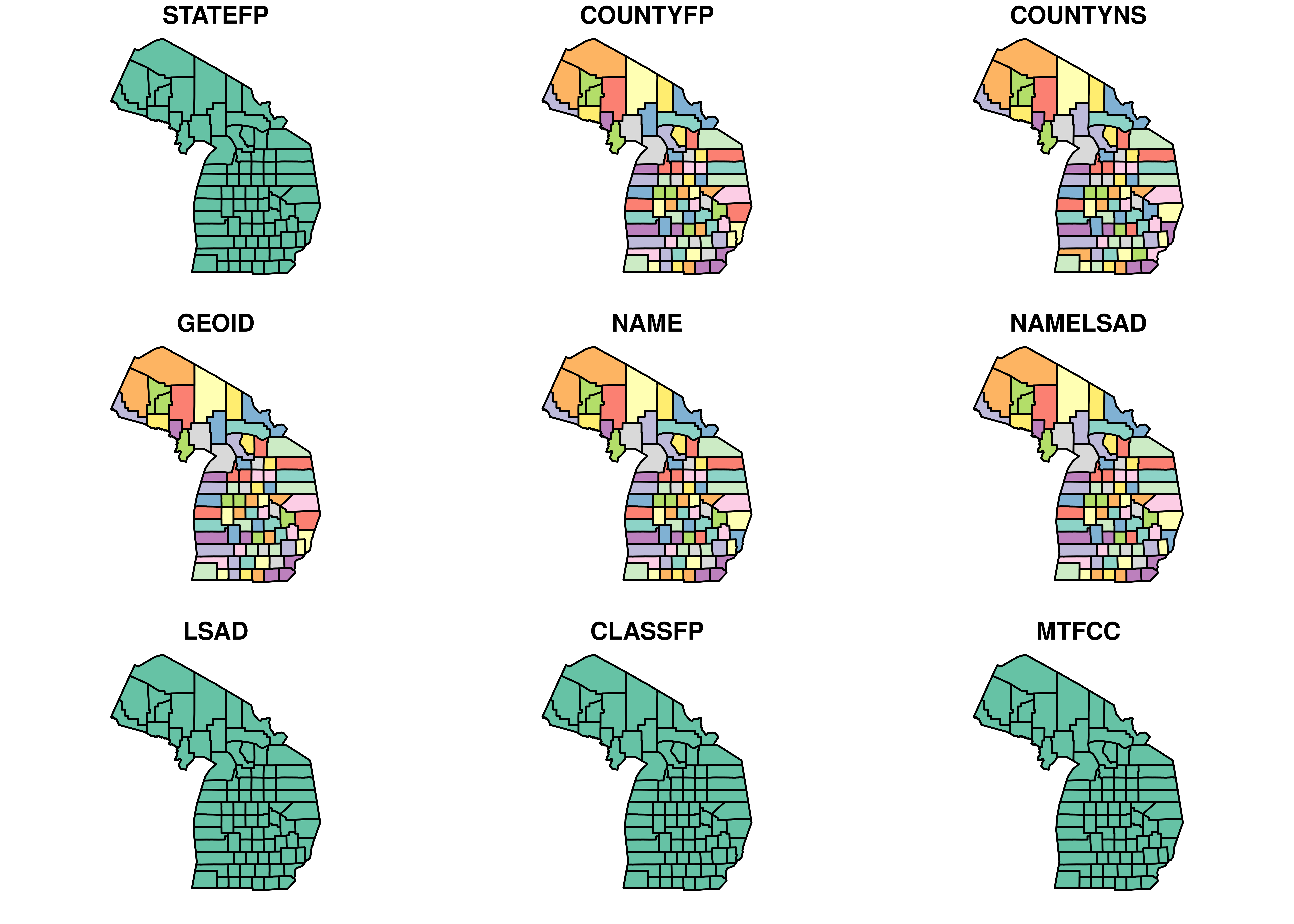
Getting data as simple features objects
The sf package, which stands for simple features, promises to revolutionize the way that vector spatial data are handled within R. sf objects represent spatial data much like regular data frames, with a list-column that contains the geometry of the geographic dataset. tigris can return spatial data as simple features objects either by declaring class = “sf” within a function call or by setting as a global option. In this exercise, you’ll get acquainted with simple features in tigris.
# Get data from tigris as simple features
options(tigris_class = "sf")

# Get countries from Colorado and view the first few rows
colorado_sf <- counties("CO")
head(colorado_sf)
Simple feature collection with 6 features and 17 fields
Geometry type: MULTIPOLYGON
Dimension: XY
Bounding box: xmin: -108.3811 ymin: 36.99961 xmax: -102.0448 ymax: 41.0026
Geodetic CRS: NAD83
STATEFP COUNTYFP COUNTYNS GEOID NAME NAMELSAD LSAD CLASSFP MTFCC
23 08 109 00198170 08109 Saguache Saguache County 06 H1 G4020
107 08 115 00198173 08115 Sedgwick Sedgwick County 06 H1 G4020
124 08 017 00198124 08017 Cheyenne Cheyenne County 06 H1 G4020
163 08 027 00198129 08027 Custer Custer County 06 H1 G4020
200 08 067 00198148 08067 La Plata La Plata County 06 H1 G4020
228 08 111 00198171 08111 San Juan San Juan County 06 H1 G4020
CSAFP CBSAFP METDIVFP FUNCSTAT ALAND AWATER INTPTLAT INTPTLON
23 <NA> <NA> <NA> A 8206547699 4454510 +38.0316514 -106.2346662
107 <NA> <NA> <NA> A 1419419015 3530746 +40.8715679 -102.3553579
124 <NA> <NA> <NA> A 4605713960 8166129 +38.8356456 -102.6017914
163 <NA> <NA> <NA> A 1913031975 3364150 +38.1019955 -105.3735123
200 <NA> 20420 <NA> A 4376255277 25642579 +37.2873673 -107.8397178
228 <NA> <NA> <NA> A 1003660672 2035929 +37.7810492 -107.6702567
geometry
23 MULTIPOLYGON (((-105.8093 3...
107 MULTIPOLYGON (((-102.2091 4...
124 MULTIPOLYGON (((-102.547 38...
163 MULTIPOLYGON (((-105.7969 3...
200 MULTIPOLYGON (((-107.7124 3...
228 MULTIPOLYGON (((-107.9751 3...# Plot its geometry column
plot(colorado_sf$geometry)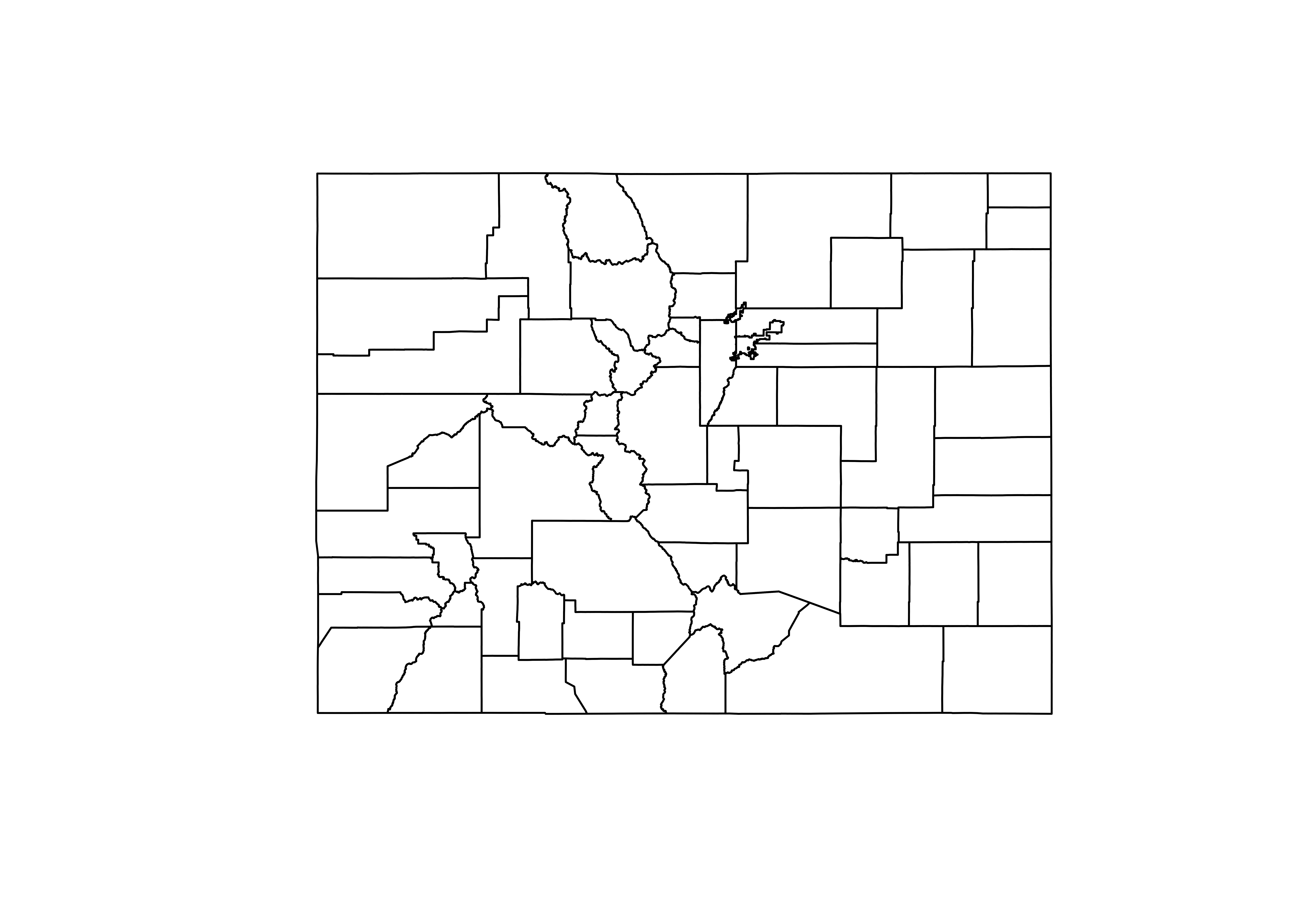
Working with historic shapefiles
To ensure clean integration with the tidycensus package - which you’ll learn about in the next chapter - tigris defaults to returning shapefiles that correspond to the year of the most recently-released ACS data. However, you may want boundary files for other years. tigris allows R users to obtain shapefiles for 1990, 2000, and 2010 through 2017, which represent many boundary changes over time. In this exercise, you’ll use tigris to explore how Census tract boundaries have changed in Williamson County, Texas between 1990 and 2016.
# Get a historic Census tract shapefile from 1990 for Williamson County, Texas
williamson90 <- tracts(state = "TX", county = "Williamson",
                       cb = TRUE, year = 1990)

# Compare with a current dataset for 2016
williamson16 <- tracts(state = "TX", county = "Williamson",
                       cb = TRUE, year = 2016)

# Plot the geometry to compare the results
par(mfrow = c(1, 2))
plot(williamson90$geometry)
plot(williamson16$geometry)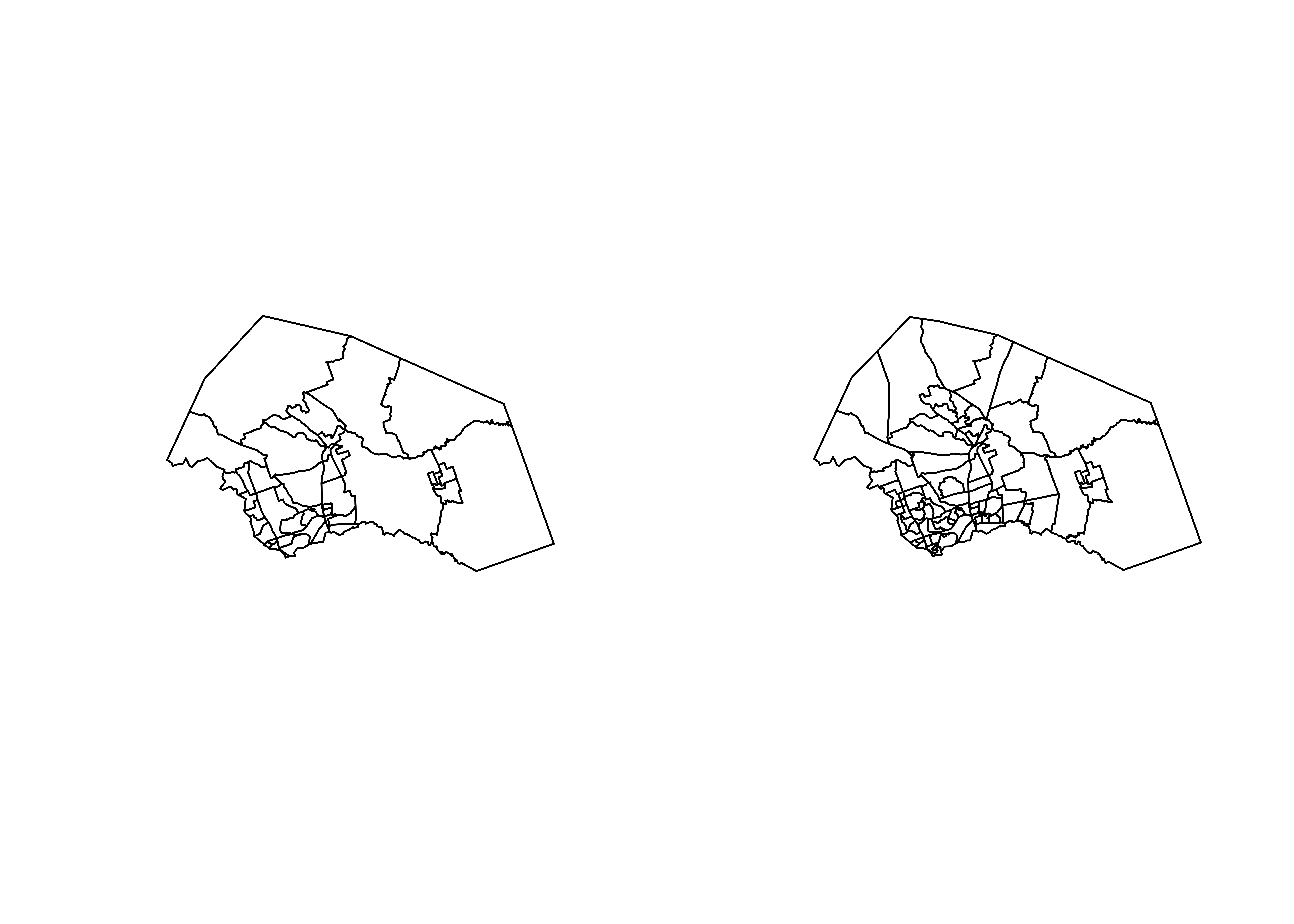
Combining datasets of the same tigris type
Often, datasets from the US Census Bureau are available by state, which means they are available by state from tigris as well. In many instances, you’ll want to combine datasets for multiple states. For example, an analysis of the Portland, Oregon metropolitan area would include areas in both Oregon and Washington north of the Columbia River; however, these areas are represented in different Census files. In this exercise, you’ll learn how to combine datasets with the rbind_tigris() function.
# Get Census tract boundaries for Oregon and Washington
or_tracts <- tracts("OR", cb = TRUE)
wa_tracts <- tracts("WA", cb = TRUE)

# Check the tigris attributes of each object
attr(or_tracts, "tigris")
[1] "tract"attr(wa_tracts, "tigris")[1] "tract"# Combine the datasets then plot the result
or_wa_tracts <- rbind_tigris(or_tracts, wa_tracts)
plot(or_wa_tracts$geometry)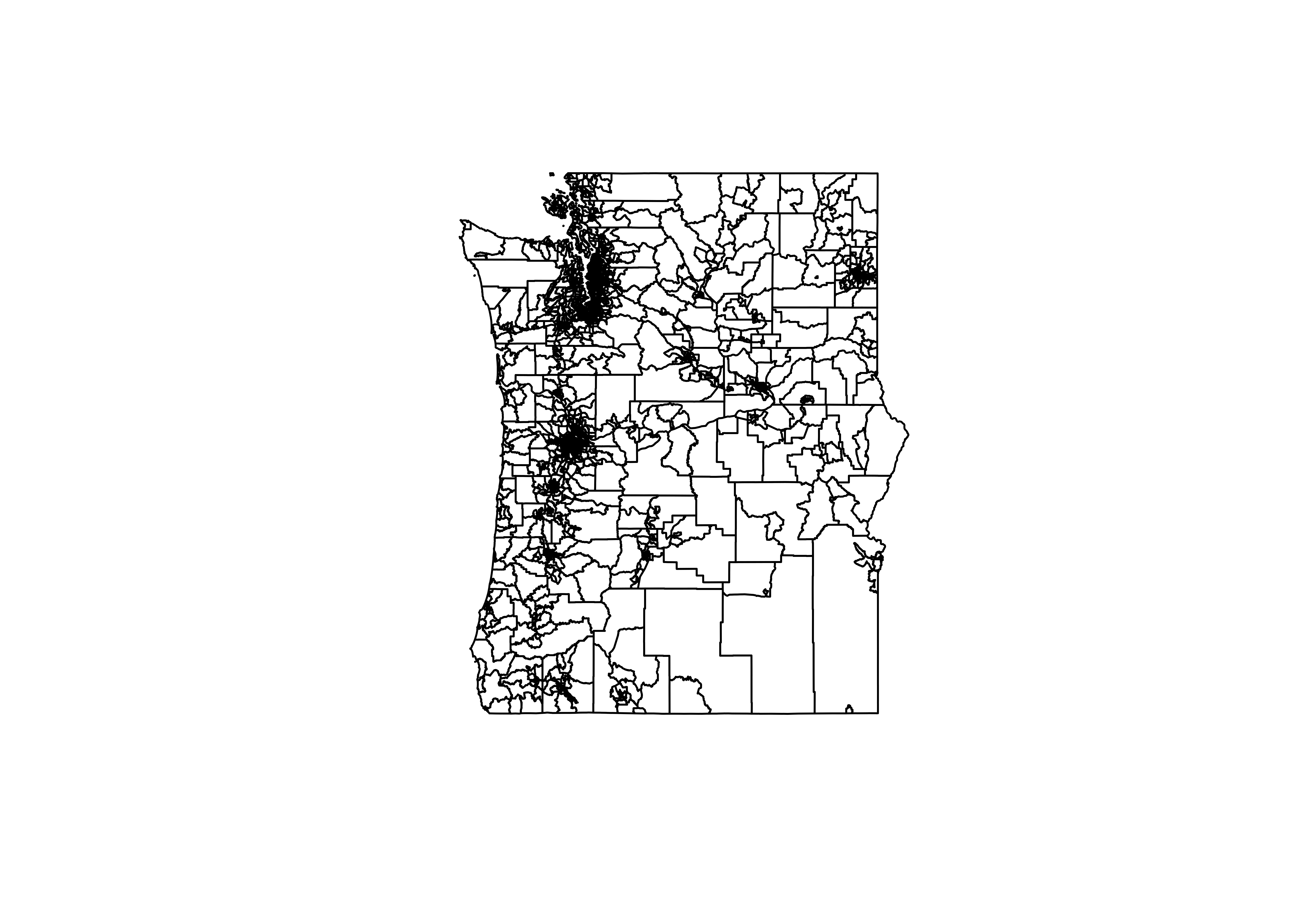
Getting data for multiple states
In the previous exercise, you learned how to combine datasets with the rbind_tigris() function. If you need data for more than two states, however, this process can get tedious. In this exercise, you’ll learn how to generate a list of datasets for multiple states with the tidyverse map() function, and combine those datasets with rbind_tigris().
# Generate a vector of state codes and assign to new_england
new_england <- c("ME", "NH", "VT", "MA")

# Iterate through the states and request tract data for state
ne_tracts <- map(new_england, function(x) {
  tracts(state = x, cb = TRUE)
}) %>%
  rbind_tigris()

plot(ne_tracts$geometry)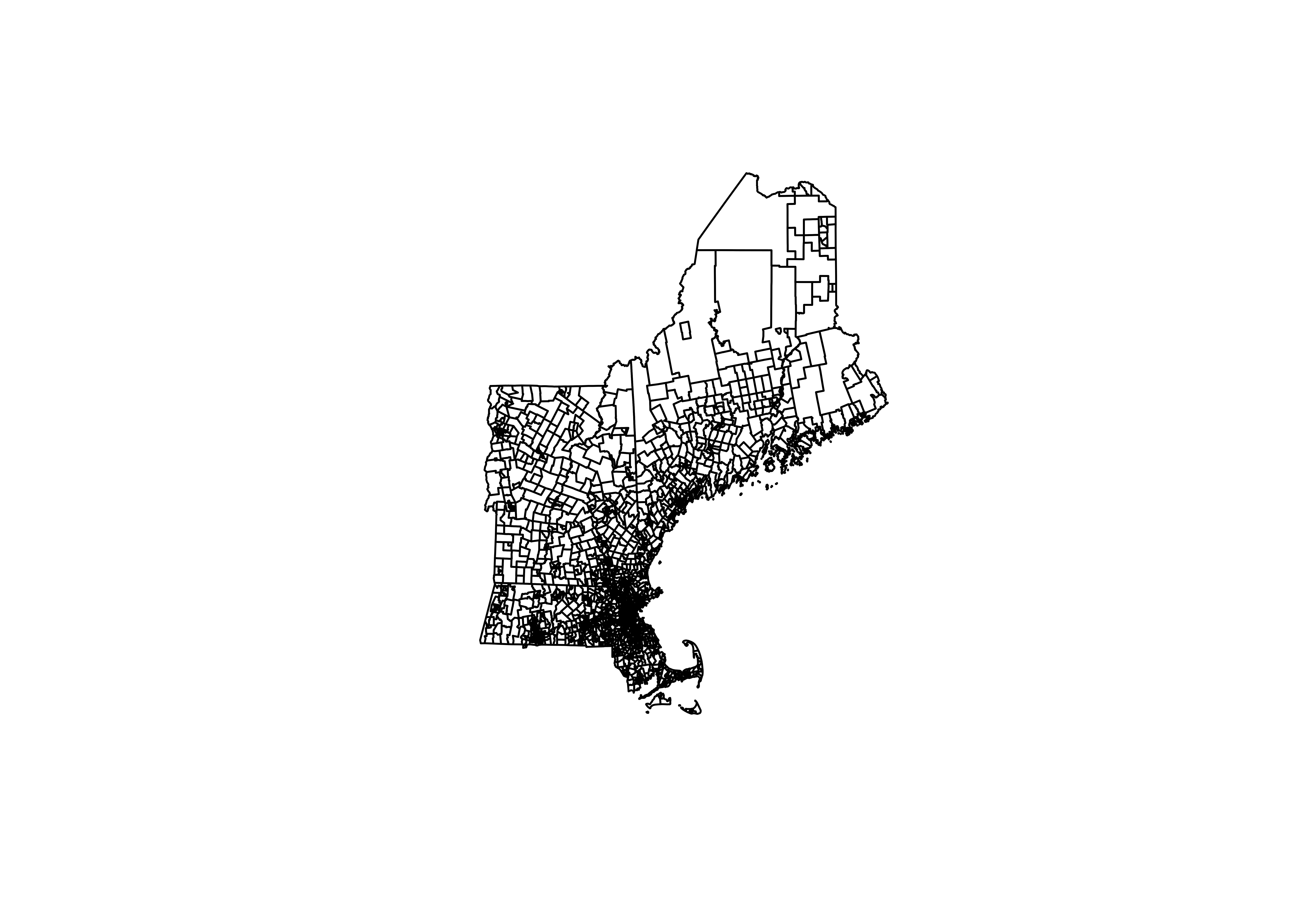
Joining data from an external data frame
When working with geographic data in R, you’ll commonly want to join attribute information from an external dataset to it for mapping and spatial analysis. The sf package enables the use of the tidyverse *_join() functions for simple features objects for this purpose. In this exercise, you’ll learn how to join data to a spatial dataset of legislative boundaries for the Texas House of Representatives that you’ve obtained using tigris.
# Get boundaries for Texas and set the house parameter
tx_house <- state_legislative_districts(state = "TX", house = "lower", cb = TRUE)

# Merge data on legislators to their corresponding boundaries
tx_joined <- left_join(tx_house, tx_members, by = c("NAME" = "District"))

head(tx_joined)
Plotting simple features with geom_sf()
The newest version of ggplot2 includes a geom_sf() function to plot simple features objects natively. This allows you to make maps using familiar ggplot2 syntax! In this exercise, you’ll walk through the process of creating a map with ggplot2 step-by-step.
# Plot the legislative district boundaries
ggplot(tx_joined) +
  geom_sf()

# Set fill aesthetic to map areas represented by Republicans and Democrats
ggplot(tx_joined, aes(fill = Party)) +
  geom_sf()

# Set values so that Republican areas are red and Democratic areas are blue
ggplot(tx_joined, aes(fill = Party)) +
  geom_sf() +
  scale_fill_manual(values = c("R" = "red", "D" = "blue"))
Customizing geom_sf() plots
As you’ve learned in previous chapters, it is a good idea to clean up and format your ggplot2 visualizations before sharing with others. In this exercise, you’ll make some modifications to your map of Texas House districts such as removing the gridlines and adding an informative title.
# Draw a ggplot without gridlines and with an informative title
ggplot(tx_joined, aes(fill = Party)) +
  geom_sf() +
  coord_sf(crs = 3083, datum = NA) +
  scale_fill_manual(values = c("R" = "red", "D" = "blue")) +
  theme_minimal(base_size = 16) +
  labs(title = "State House Districts in Texas")
Getting simple feature geometry
tidycensus can obtain simple feature geometry for many geographies by adding the argument geometry = TRUE. In this exercise, you’ll obtain a dataset of median housing values for owner-occupied units by Census tract in Orange County, California with simple feature geometry included.
library(tidycensus)
library(tidyverse)
library(sf)

# Get dataset with geometry set to TRUE
orange_value <- get_acs(geography = "tract", state = "CA",
                    county = "Orange",
                    variables = "B25077_001",
                    geometry = TRUE)

# Plot the estimate to view a map of the data
plot(orange_value["estimate"])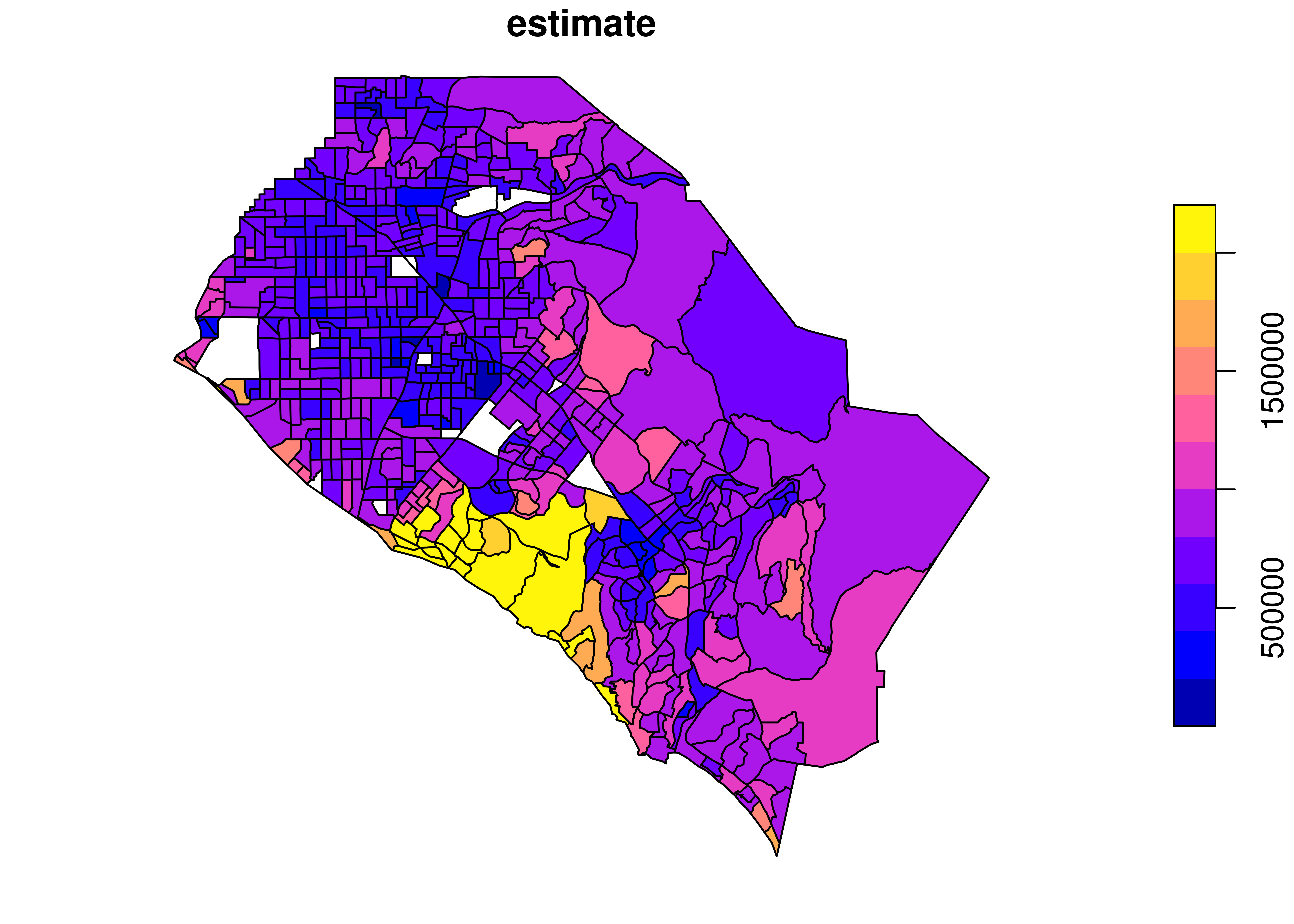
Joining data from tigris and tidycensus
Geometry is currently supported in tidycensus for geographies in the core Census hierarchy - state, county, Census tract, block group, and block - as well as zip code tabulation areas. However, you may be interested in mapping data for other geographies. In this case, you can download the equivalent boundary file from the Census Bureau using the tigris package and join your demographic data to it for mapping.
# Get an income dataset for Idaho by school district
idaho_income <- get_acs(geography = "school district (unified)",
                        variables = "B19013_001",
                        state = "ID")

# Get a school district dataset for Idaho
idaho_school <- school_districts(state = "ID", type = "unified", class = "sf")

# Join the income dataset to the boundaries dataset
id_school_joined <- left_join(idaho_school, idaho_income, by = "GEOID")

plot(id_school_joined["estimate"])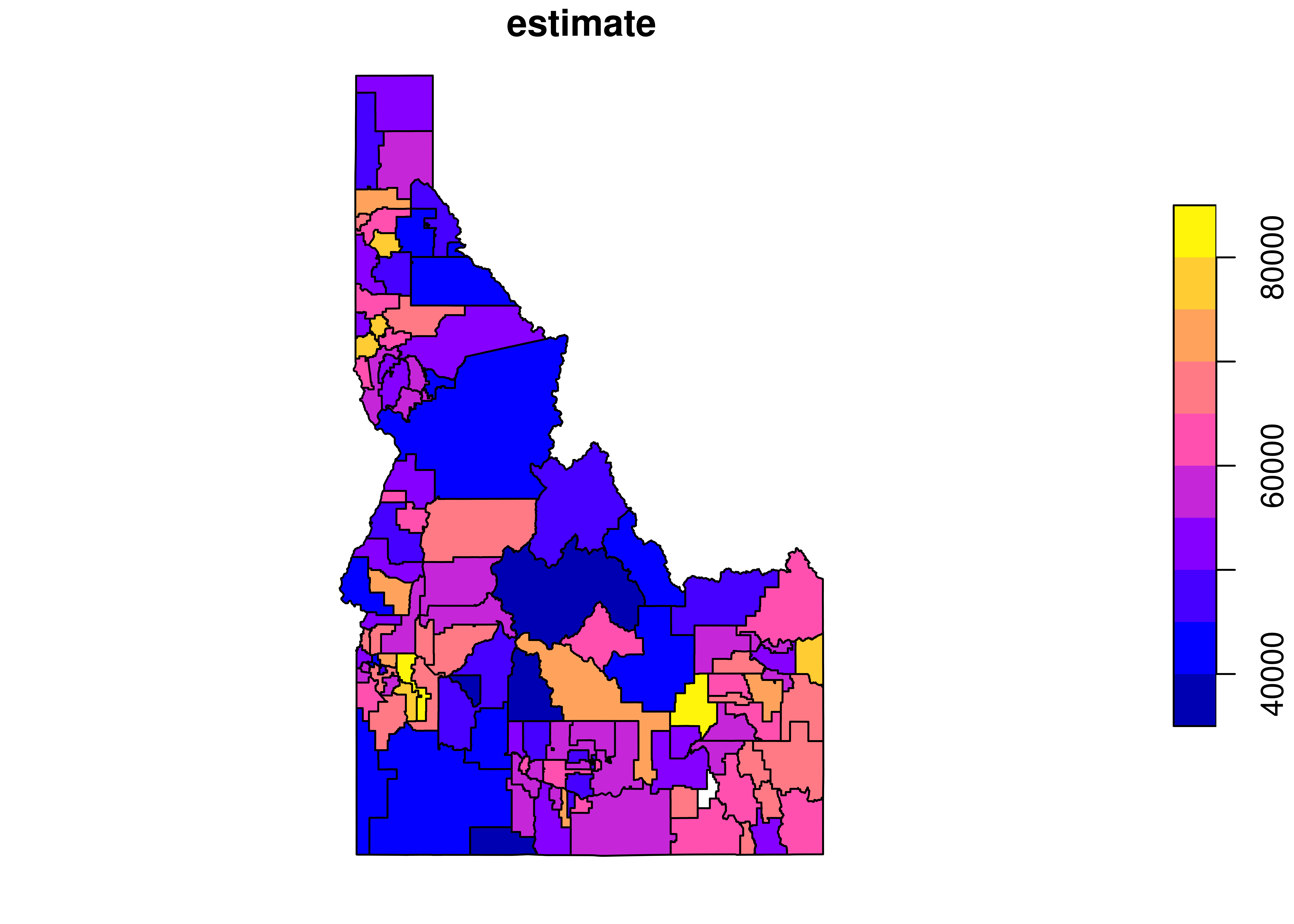
Shifting Alaska and Hawaii geometry
Analysts will commonly want to map data for the entire United States by state or county; however, this can be difficult by default as Alaska and Hawaii are distant from the continental United States. A common solution is to rescale and shift Alaska and Hawaii for mapping purposes, which is supported in tidycensus. You’ll learn how to do this in this exercise.
# Get a dataset of median home values from the 1-year ACS
state_value <- get_acs(geography = "state",
                       variables = "B25077_001",
                       survey = "acs1",
                       geometry = TRUE,
                       shift_geo = TRUE)

# Plot the dataset to view the shifted geometry
plot(state_value["estimate"])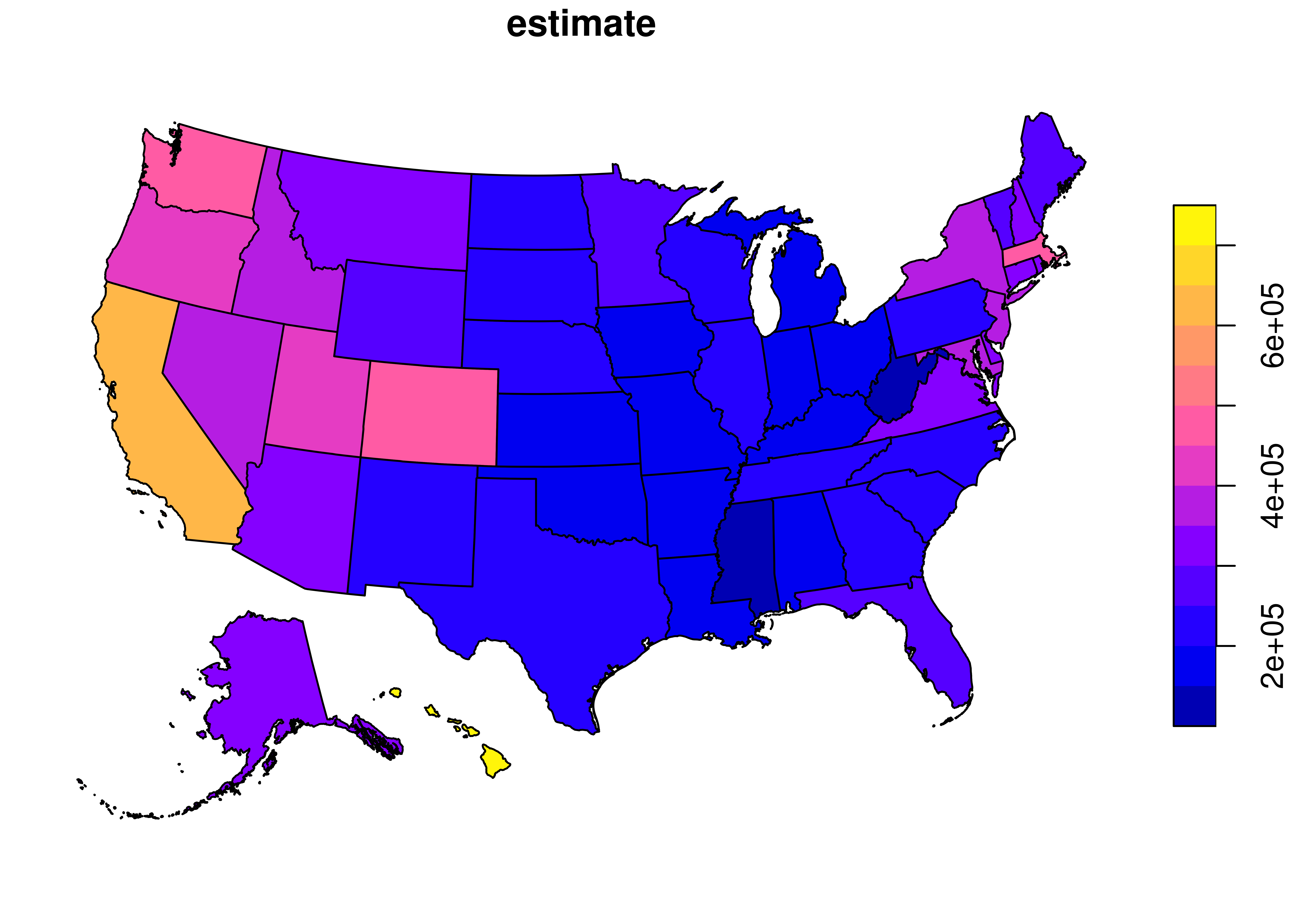
Making a choropleth map
Choropleth maps, which visualize statistical variation through the shading of areas, are among the most popular ways to map demographic data. Census or ACS data acquired with tidycensus can be mapped in this way in ggplot2 with geom_sf using the estimate column as a fill aesthetic. In this exercise, you’ll make a choropleth map with ggplot2 of median owner-occupied home values by Census tract for Marin County, California.
# Create a choropleth map with ggplot
ggplot(marin_value, aes(fill = estimate)) +
  geom_sf()
Modifying map colors
ggplot2 version 3.0 integrated the viridis color palettes, which are perceptually uniform and legible to colorblind individuals and in black and white. For these reasons, the viridis palettes have become very popular for data visualization, including for choropleth mapping. In this exercise, you’ll learn how to use the viridis palettes for choropleth mapping in ggplot2.
# Set continuous viridis palettes for your map
ggplot(marin_value, aes(fill = estimate, color = estimate)) +
  geom_sf() +
  scale_fill_viridis_c() +
  scale_color_viridis_c()
Customizing the map output
Now that you’ve chosen an appropriate color palette for your choropleth map of median home values by Census tract in Marin County, you’ll want to customize the output. In this exercise, you’ll clean up some map elements and add some descriptive information to provide context to your map.
# Set the color guide to FALSE and add a subtitle and caption to your map
ggplot(marin_value, aes(fill = estimate, color = estimate)) +
  geom_sf() +
  scale_fill_viridis_c(labels = scales::dollar) +
  scale_color_viridis_c(guide = FALSE) +
  theme_minimal() +
  coord_sf(crs = 26911, datum = NA) +
  labs(title = "Median owner-occupied housing value by Census tract",
       subtitle = "Marin County, California",
       caption = "Data source: 2012-2016 ACS.\nData acquired with the R tidycensus package.",
       fill = "ACS estimate")
Graduated symbol maps
There are many other effective ways to map statistical data besides choropleth maps. One such example is the graduated symbol map, which represents statistical variation by differently-sized symbols. In this exercise, you’ll learn how to use the st_centroid() tool in the sf package to create points at the center of each state to be used as inputs to a graduated symbol map in ggplot2.
library(sf)

# Generate point centers
centers <- st_centroid(state_value)

# Set size parameter and the size range
ggplot() +
  geom_sf(data = state_value, fill = "white") +
  geom_sf(data = centers, aes(size = estimate), shape = 21,
          fill = "lightblue", alpha = 0.7, show.legend = "point") +
  scale_size_continuous(range = c(1, 20))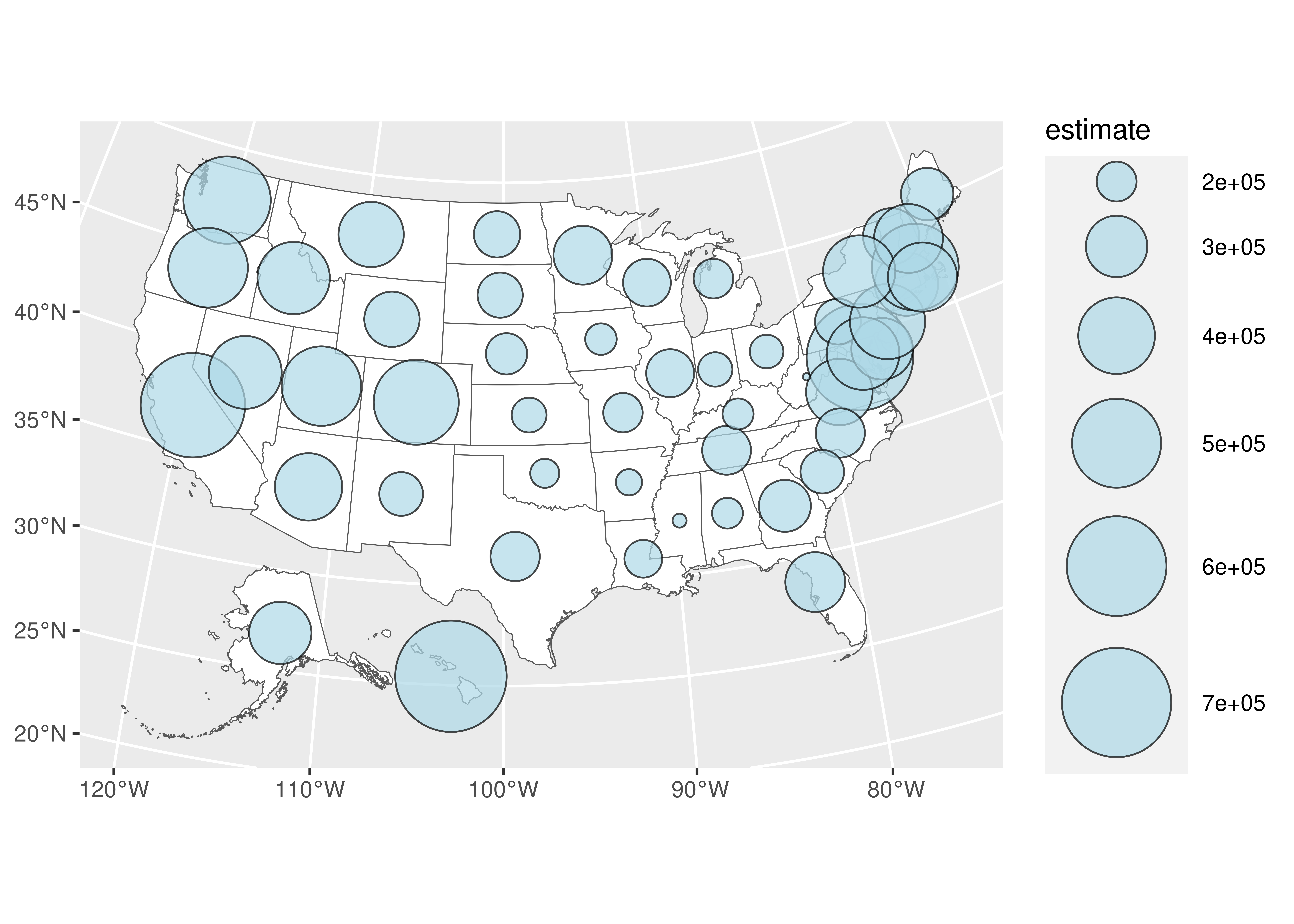
Faceted maps with ggplot2
One of the most powerful features of ggplot2 is its support for faceted plotting, in which multiple plots are generated for unique values of a column in the data. Faceted maps can be produced with geom_sf() in this way as well if tidycensus data are in tidy format. In this exercise, you’ll produce faceted maps that show the racial and ethnic geography of Washington, DC from the 2010 decennial Census.
# Check the first few rows of the loaded dataset dc_race
head(dc_race)

# Remove the gridlines and generate faceted maps
ggplot(dc_race, aes(fill = percent, color = percent)) +
  geom_sf() +
  coord_sf(datum = NA) +
  facet_wrap(~variable)
Interactive visualization with mapview
The mapview R package allows R users to interactively map spatial datasets in one line of R code. This makes it an essential tool for exploratory spatial data analysis in R. In this exercise, you’ll learn how to quickly map tidycensus data interactively using mapview and your Orange County, California median housing values dataset.
# Add a legend to your map
m <- mapview(orange_value,
         zcol = "estimate",
         legend = TRUE)
m@map
Generating random dots with sf
Dot-density maps are created by randomly placing dots within areas where each dot is proportional to a certain number of observations. In this exercise, you’ll learn how to create dots in this way with the sf package using the st_sample() function. You will generate dots that are proportional to about 100 people in the decennial Census, and then you will group the dots to speed up plotting with ggplot2.
# Generate dots, create a group column, and group by group column
dc_dots <- map(c("White", "Black", "Hispanic", "Asian"), function(group) {
  dc_race %>%
    filter(variable == group) %>%
    st_sample(., size = .$value / 100) %>%
    st_sf() %>%
    group_by(group = group)
}) %>%
  reduce(rbind) %>%
  group_by(group) %>%
  summarize()
Obtaining data for cartography with tigris
Before making your dot-density map of Washington, DC with ggplot2, it will be useful to acquire some ancillary cartographic data with the tigris package that will help map viewers understand what you’ve visualized. These datasets will include major roads in DC; area water features; and the boundary of the District of Columbia, which you’ll use as a background in your map.
# Filter the DC roads object for major roads only
dc_roads <- roads("DC", "District of Columbia") %>%
  filter(RTTYP %in% c("I", "S", "U"))

# Get an area water dataset for DC
dc_water <- area_water("DC", "District of Columbia")

# Get the boundary of DC
dc_boundary <- counties("DC", cb = TRUE)
Making a dot-density map with ggplot2
In your final exercise of this course, you are going to put together the datasets you’ve acquired and generated into a dot-density map with ggplot2. You’ll plot your generated dots and ancillary datasets with geom_sf(), and add some informative map elements to create a cartographic product.
# Plot your datasets and give your map an informative caption
ggplot() +
  geom_sf(data = dc_boundary, color = NA, fill = "white") +
  geom_sf(data = dc_dots, aes(color = group, fill = group), size = 0.1) +
  geom_sf(data = dc_roads, color = "lightblue", fill = "lightblue") +
  geom_sf(data = dc_water, color = "grey") +
  coord_sf(crs = 26918, datum = NA) +
  scale_color_brewer(palette = "Set1", guide = FALSE) +
  scale_fill_brewer(palette = "Set1") +
  labs(title = "The racial geography of Washington, DC",
       subtitle = "2010 decennial U.S. Census",
       fill = "",
       caption = "1 dot = approximately 100 people.\nData acquired with the R tidycensus and tigris packages.")